Dark Cellar Glass
The direction you picked, now built across the real app — every tab, wired to the live backend, functionality unchanged. A deep ink-charcoal cellar (deliberately not wine-garnet), a warm amber candle-glow, Cormorant over Archivo, and the things worth keeping rendered as glass: thin light edges, a top catchlight, quiet depth.
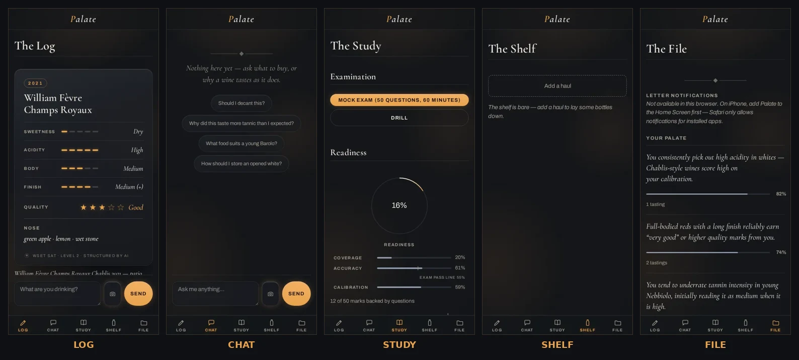
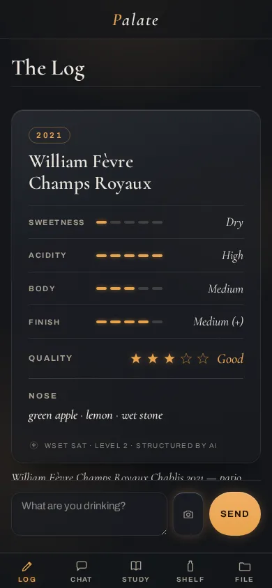
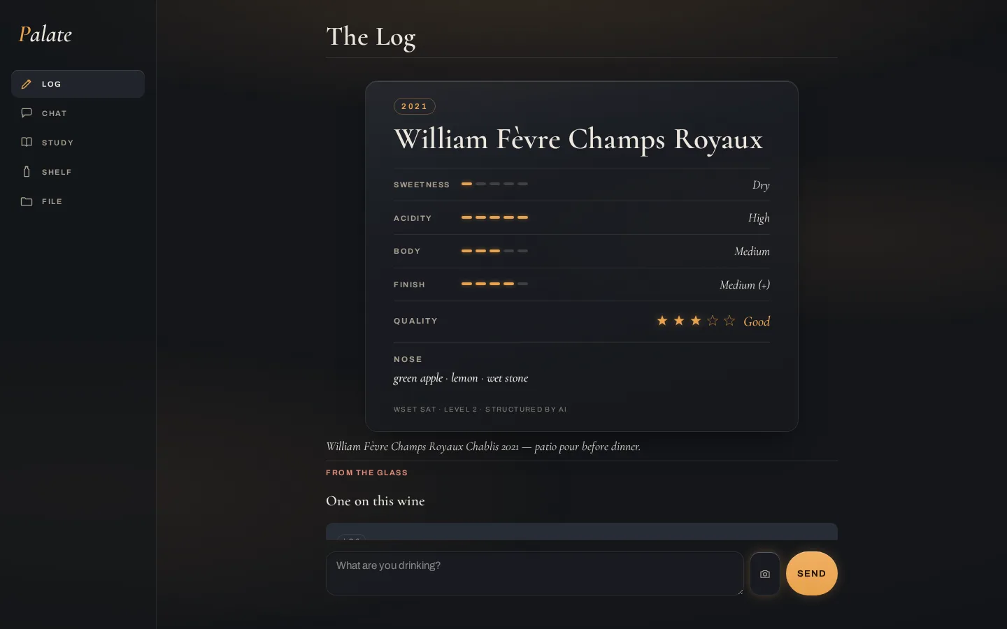
The Log
A tasting typed in plain words becomes a glass record — amber SAT dots, the ordinal word beside each, quality in amber stars, your original note kept underneath.
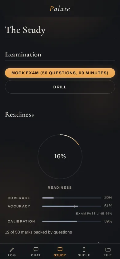
Study
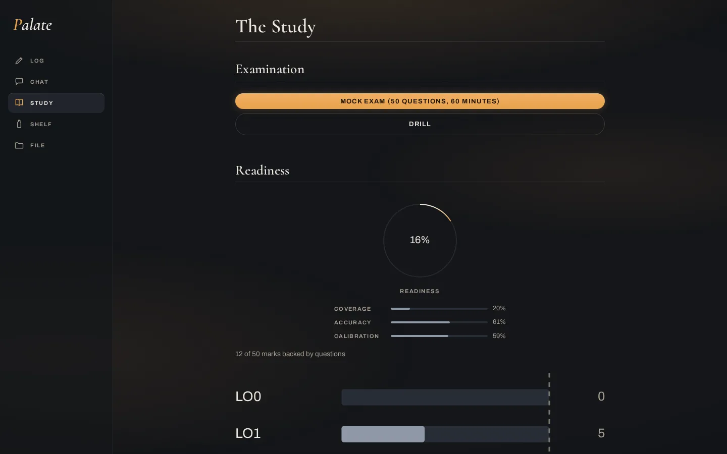
Readiness as one honest number broken into coverage / accuracy / calibration, marks-per-unit against target. Amber arcs on ink.
The File
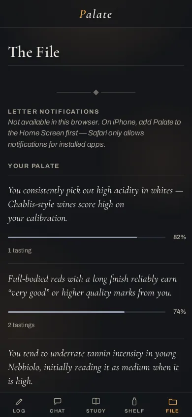
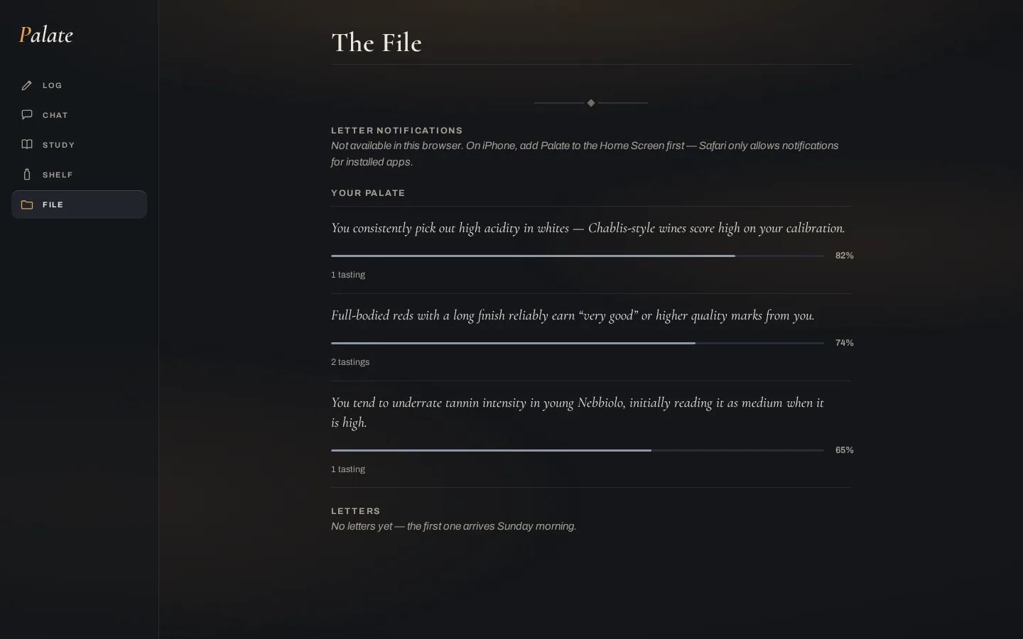
What Palate has learned about you as a taster — each claim with its confidence and how many tastings back it. No invented charts.
Chat & Shelf
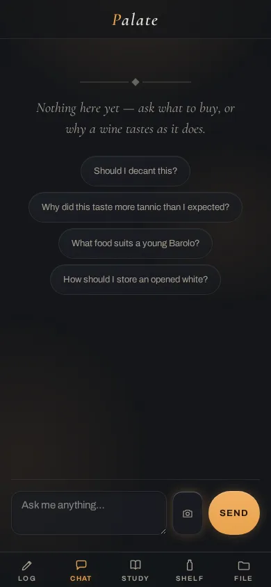
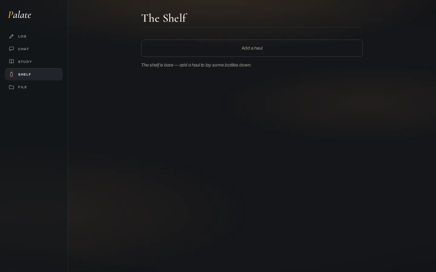
Both are genuinely empty right now — shown honestly rather than filled with fake bottles or fake conversation.
Post-review polish applied (5bf9edc). A four-lens creative review drove a round of fixes now live above: amber discipline — amber is reserved for the lit/interactive (Readiness ring, buttons, quality verdict, SAT fill) while passive metrics (Coverage/Accuracy/Calibration, File confidence) went to a muted slate, so a low score no longer glows as confidently as a high one; the SAT meter switched to pill-bars matching this direction; "The Study" title added; curly quotes; a fixed mobile-Log first frame; and several WCAG contrast/target fixes.
Still open: native date/select controls are OS-drawn (only border/background themed) — a themed custom control is the next real fix. The letter card, bottle rows and PDF table remain restyled-but-unseen for lack of seed data.