Étiquette
A clean-slate identity for the wine-tasting & WSET study app. The screen is the cellar — a deep garnet dark that is unmistakably wine — and the things worth keeping are paper wine labels: chalk paper, garnet ink, hard corners. The accent is Bordeaux-mixture verdigris, the blue-green sprayed on vine rows. Type is Bodoni Moda (the European wine-label Didone) with a grotesk for the working UI. Nothing carried over from the old design.
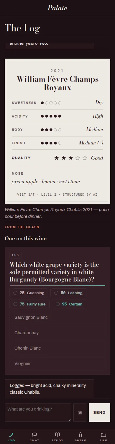
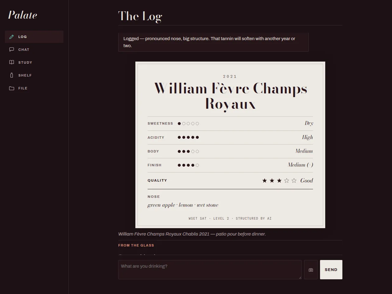
The Log
A tasting typed in plain words becomes the wine's own paper label — vintage, Didone name, ruled SAT rows (ordinal word + 1–5 dots), the aroma run as its tasting note. Calibration questions surface inline.
Study
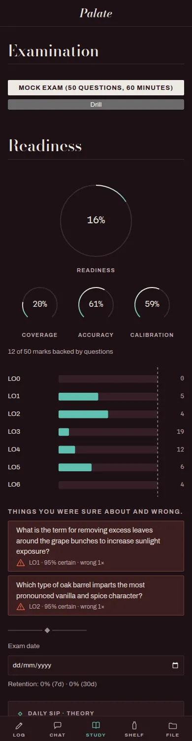
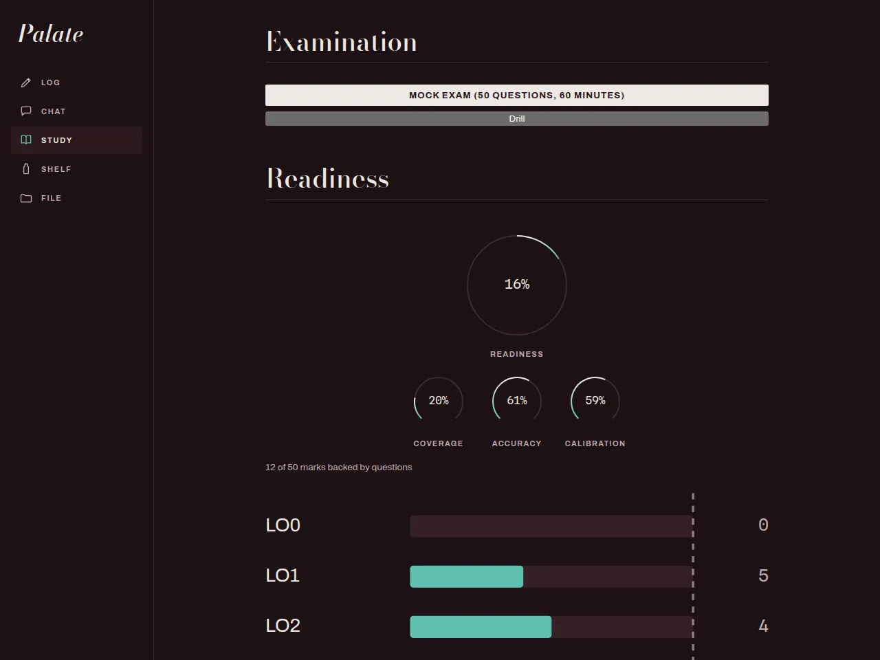
Readiness as one honest number, broken into coverage / accuracy / calibration, marks-per-unit against a target, and the questions you were sure about and got wrong.
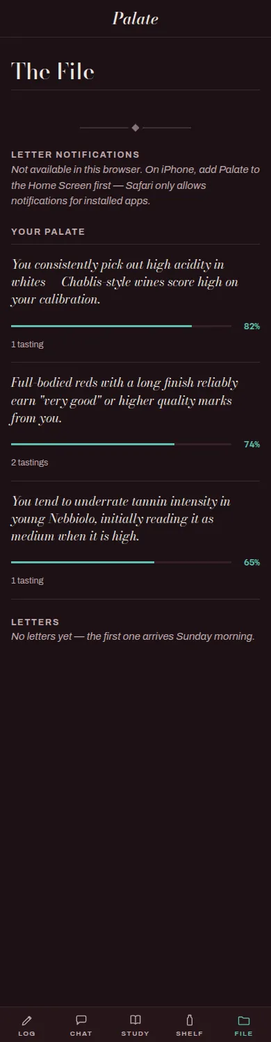
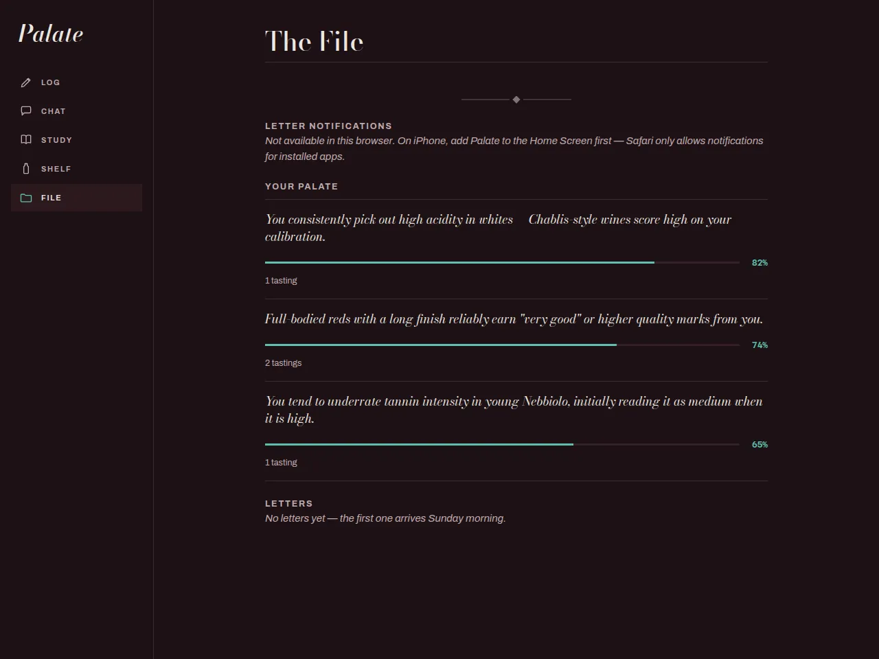
The File
What Palate has learned about you as a taster — claims with confidence and evidence — and the weekly Analyst's Letters. No invented charts; only what your tastings support.