Round 4 · live
Spectral, built for real
The dashboard now runs on the Spectral direction you picked — not a mockup of it. Everything below is a photograph of the actual page rendering your actual data. Building it turned up twelve real problems — six on my own, six more from two independent audits — and nearly every one was the page quietly claiming something untrue.
Where it stands
This is now what dashboard.thomaspeng.ca serves.
Deployed 2026-08-12: main fast-forwarded to 5a848d6, rebuilt in place and the
service restarted. Verified after restart — the running server serves the new build, the old
build's assets are gone, the sign-in gate still refuses unauthenticated requests, and the
service log is clean.
The floating dock and app launcher went live 2026-08-13, along with the fix
to what the ask box is told about your data. A follow-up fix on 2026-08-14 brought main to
14126e7. Verified after each restart: the new page code is served, the previous
build's assets return 404, the sign-in gate still refuses unauthenticated requests on both the
page and the ask endpoint, and the service log is clean.
The first version of the launcher shipped broken, and I want that on the record
It rendered perfectly and ignored the mouse entirely — the list would not scroll and no app could be clicked. The panel sits in a click-through corner and had not opted back in to receiving mouse input. Every check I ran was keyboard-driven, and keyboard focus does not travel through mouse events, so tabbing between apps and screenshotting the open list both looked completely healthy on a panel no mouse could touch. You found it by using it. The fix is one line; the useful part is that the tests now render the list in its open state and assert it accepts a click, and I confirmed that assertion fails against the broken version before trusting it.
Built after the deploy
The corner: apps and the ask box, always within reach
Two things you might want while looking at something now live in the bottom-right
corner instead of at the foot of a 3,300 px page. Press / to ask a
question, g to open an app. Both keys are printed on their buttons rather than
left to be discovered.
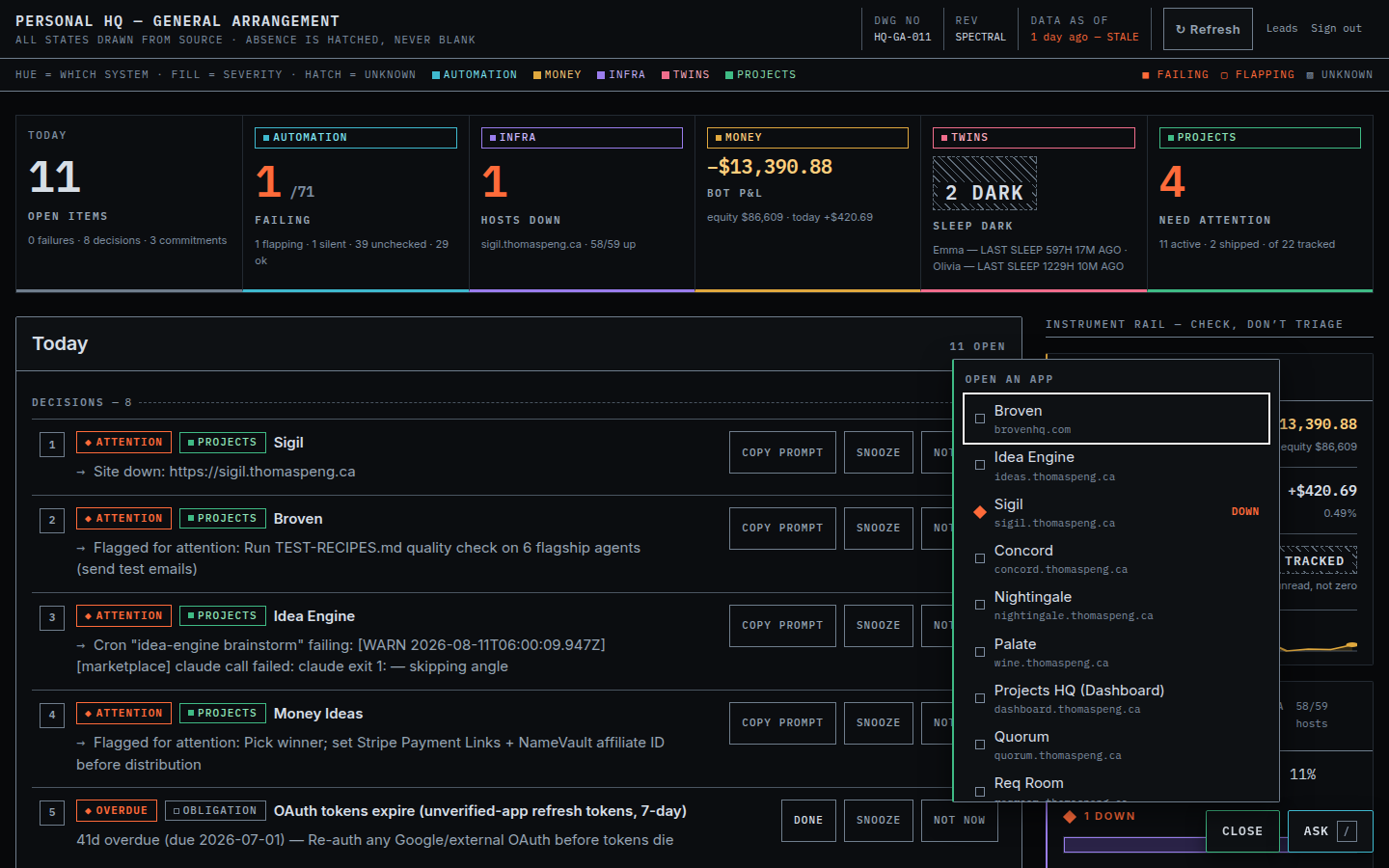
The launcher open at 1440×900. Sigil is marked DOWN; the collapsed button carries the same count so you see it without opening anything.
The list is derived, not maintained
Every app with a live address appears automatically — 19 today, ordered so the ones needing attention come first. Add a project with a host and it shows up; retire one and it goes. There is no second list of bookmarks to keep in sync, which is the thing that would have rotted.
What it knows that a browser bookmark does not is whether the app answered its last uptime check. A dead site says so in the list, so it costs you a glance instead of a click, a page load and a wait. It is marked, not hidden or disabled — the check can be wrong on a transient network fault, so the link still works and you get to judge.
A bug the browser caught that the tests could not
With each control minding its own business, pressing g and
then / left both panels open, expanding from the same corner — the ask box sat
over the bottom of the app list and hid three apps with nothing to say they were there.
Neither piece could prevent it, because neither knew the other existed. The corner is now one
thing that holds a single answer to "which panel is open", so two-at-once is no longer a
state the code can be in. I only found it by driving a real browser; every test was green.
Phone
Side by side, the app list is anchored to a button set in from the edge — at phone width that pushed its left edge 63 px off-screen and quietly clipped every app name. Below 720 px the two controls stack instead, so each panel opens into the full width.
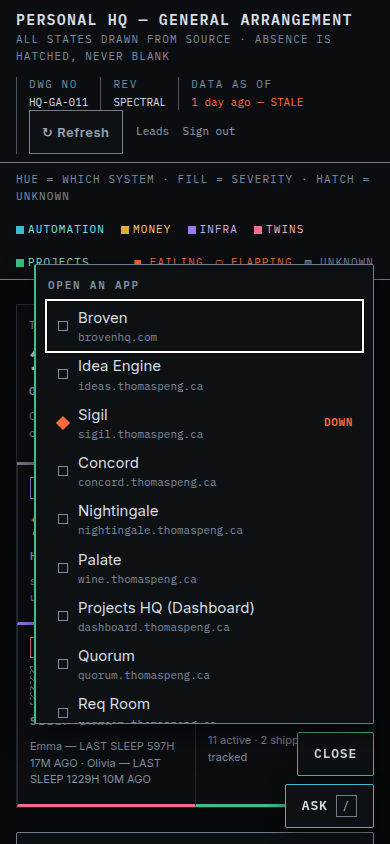
390×844, after the fix — the whole list fits.
Six deliberate breakages were run against the new code to check the tests are worth anything: flattening "never checked" into "fine", counting unchecked apps as down, un-pinning the corner, letting it swallow clicks on the page beneath, dropping the ordering, and hiding down apps instead of marking them. Each one was caught by a test that named the actual problem.
The page
Desktop, 1440 × 900
What you see without scrolling: the drawing-sheet masthead, the legend that states the colour rule in words, the six-cell stat strip, and the top of the TODAY rail.
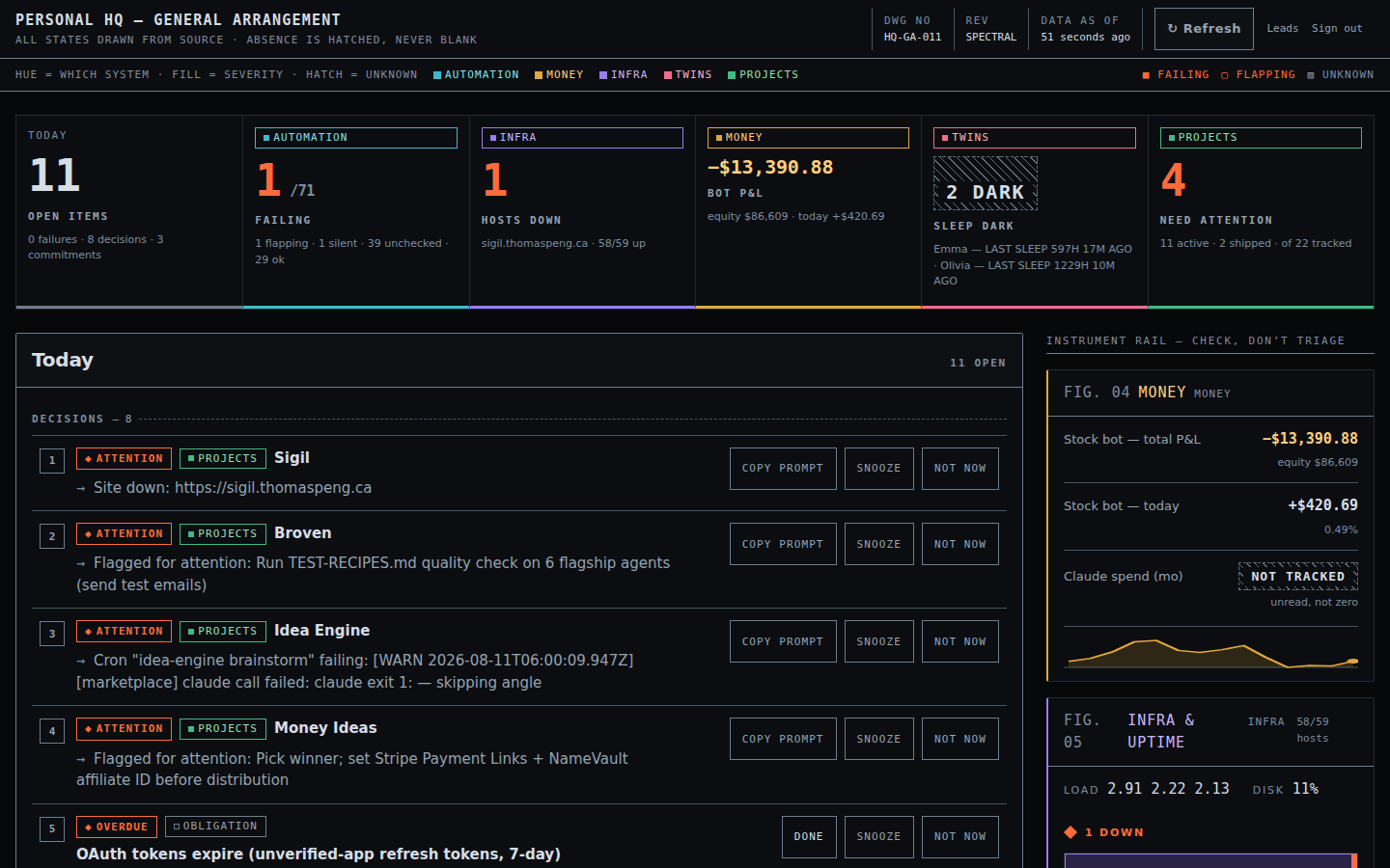
Above the fold at 1440×900. Open for full resolution.
The whole page
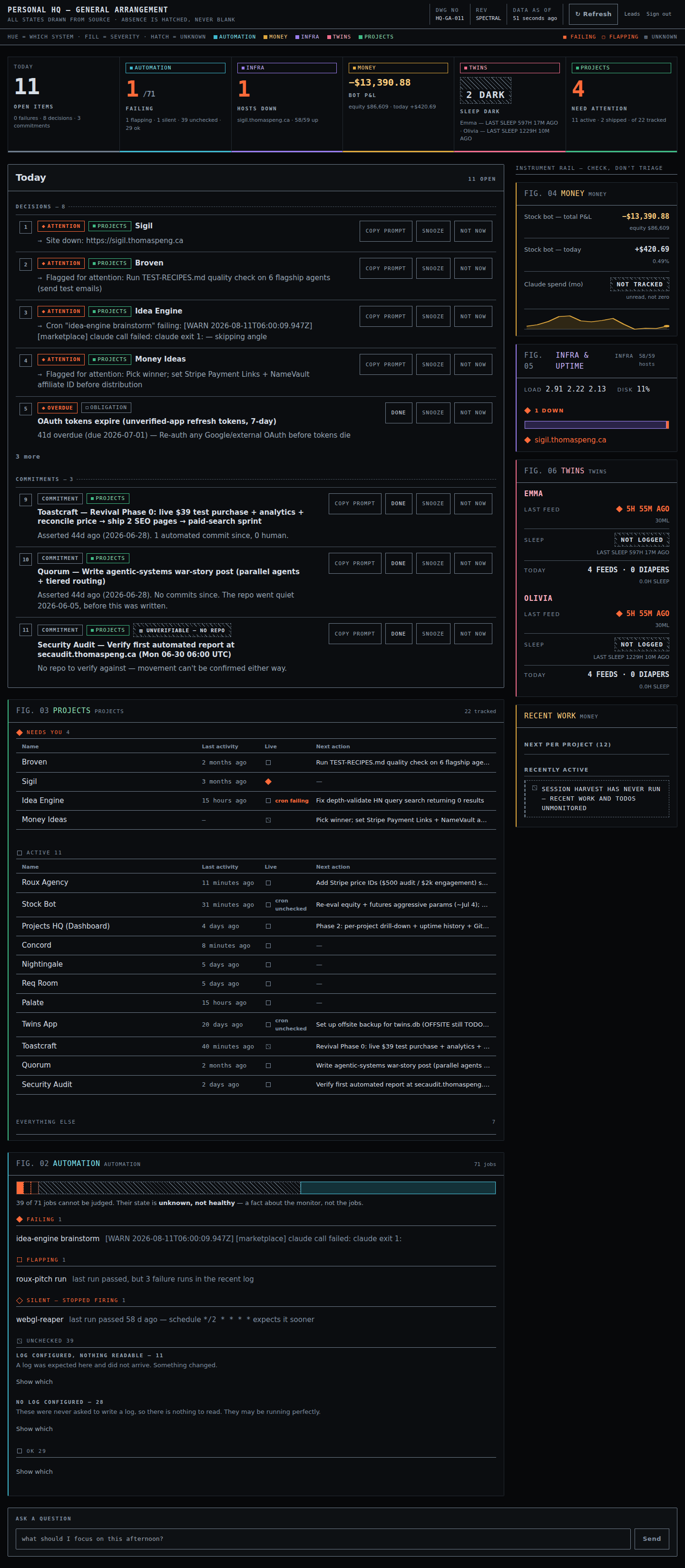
Full page. Wide column: TODAY, projects, automation. Right rail: money, infra, twins, recent work.
Phone
You said this is mostly a desktop page, so the phone view was built to not embarrass itself rather than to be the primary target. The columns stack, the stat strip becomes a two-across grid, and nothing is hidden that desktop shows.

Full page at 390px.
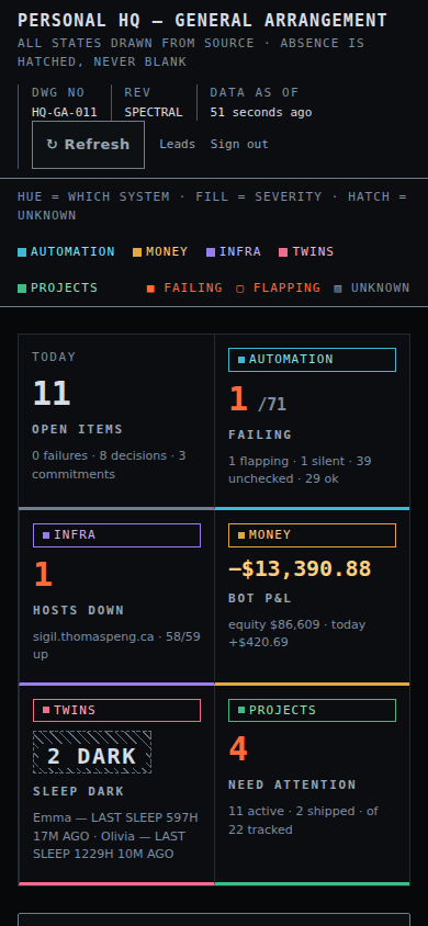
Above the fold at 390×844.
The one rule the design rests on
Colour tells you which system. It never tells you how bad.
Five hues identify the five systems the page reports on — automation is cyan, money amber, infra violet, twins rose, projects emerald. Not one of them is ever used to mean trouble. Severity gets exactly one colour, the orange, and the states are told apart by shape:
| State | Drawn as | Why that shape |
|---|---|---|
| Failing | solid orange diamond | the conventional alert shape, readable at 10px with no second colour |
| Flapping | dashed orange square | last run passed but recent runs failed — shares the hue, differs in fill |
| Silent | hollow orange diamond | a fault, so a diamond; not erroring right now, so not filled |
| Unchecked | hatched hole, no colour at all | a filled marker in any hue would claim the monitor had looked. It didn't. |
| OK | plain grey outline | no severity colour is spent on "fine", so the ordinary never competes with the urgent |
The practical payoff: a failure looks identical whichever system it belongs to, so a problem in a quiet-coloured area cannot be visually dimmed. And every state survives being printed in greyscale — which is the actual accessibility requirement, tested by stripping every colour out of the markup and checking the five states are still five different things.
Tokens carry a role, and the role sets the bar
Every one of the 29 colours declares what it is for — text, graphic, surface, or decoration — and the test suite derives the contrast floor from that declaration rather than from a hand-written list. Text owes 4.5:1 against every surface it can land on; a graphic that carries meaning owes 3:1; anything that measures less must literally declare itself decoration and say so in its own description. The point is that a new colour cannot be added without being caught, which the old hand-maintained list of 29 pairs could not promise.
What building it turned up
Six bugs I found myself, none cosmetic
These are worth reading because nearly every one was the page telling you something untrue, which is the exact thing this dashboard exists to not do. Two independent audits found six more; those are in the next section.
High Cron jobs that stop firing were healthy forever
A job is judged by its last recorded run. If that run passed, it was green — permanently. A job whose crontab line got commented out, or whose command broke before it could write a log, kept its last successful run and sat in the OK bucket indefinitely. Systemd timers never had this problem because systemd can be asked what runs next; cron has nothing to ask.
The page now compares each schedule against the age of its last run and reports a
SILENT bucket. It found one immediately: webgl-reaper, which is
supposed to run every two minutes and last ran 57 days ago.
The check refuses to guess. Any schedule whose real gap needs a calendar — weekday-only,
day-of-month, @reboot, lists and ranges — is declined outright rather than
flagged, because a false "stopped firing" every weekend would teach you to ignore the heading
entirely.
High …and then that new check used the wrong clock
Worth flagging plainly: the first version of the above compared against the current time. But this page renders a snapshot file written by a cron job, and that file is routinely hours old — it says so in its own masthead. So the check was measuring how late the file was, not how quiet the job was. On real data it reported three stopped jobs, and two of them had last run three and eight minutes before the snapshot was taken. They were perfectly healthy.
Fixed by measuring against the snapshot's own capture time, and by declining to judge at all when that timestamp is missing or unreadable rather than quietly falling back to now.
The test suite was green through all of it
Every fixture built its timestamps from the current time — so the tests and the buggy code read the same wrong clock and agreed perfectly. A test cannot tell you which clock the code chose if it reads the same one. The fixtures are now pinned to a fixed snapshot instant, and putting the bug back now fails nine tests across three files.
Medium The headline strip disagreed with the panel below it
The stat strip said "27 ok" directly above a panel reporting "24 ok, 3 silent" — because the strip divided the jobs four ways and had never been taught about the fifth bucket. Two places counting the same thing on different axes. Both now read from one shared function, and the buckets are tested to be non-overlapping and to add up to the job total.
High "Recent Work" reported a zero it had invented
The panel printed "0 sessions" in its heading and the sentence "No recent sessions." in its body. Both are confident claims about your week. Both were produced by a file that does not exist.
The code that reads it wrapped the read in a catch-everything that silently substituted an empty list, so "the harvester has never run" and "you did no Claude work" rendered identically. That is the same fabricated zero the money panel has had a guard against for months — it deliberately prints the word "unreadable" rather than $0.00, precisely because a made-up zero cannot be told apart from a real one.
There are now three outcomes instead of two: a genuine empty week still says "No recent sessions"; a missing file says session harvest has never run; a file that exists and won't parse says unreadable and shows the error. The last two are kept apart because one means "wire this up" and the other means "something broke" — and the count is suppressed entirely rather than printed as a zero next to the warning.
Correction — I overstated this one
Before deploying I said the harvester had never run and that this panel had been showing you an invented zero all along. That was wrong. It was true of my working copy, which never had the harvest file; on the live box the harvester runs fine and the file was 16 minutes old when I checked. So the panel has been telling the truth in production. The bug is still real and still worth having fixed — a missing or unparseable file would have rendered as a confident "0 sessions" — it simply was not firing for you. I checked the wrong machine and stated the result too confidently.
Medium "Unchecked" was hiding two different situations
The panel described forty jobs with one sentence — "40 of 72 jobs emit no readable log" — that was only true of twelve of them. The other twenty-eight were never asked to write a log at all: their crontab lines carry no redirect, so there is nothing to read and never was.
They call for opposite responses. A job with no log configured needs a redirect added to its crontab line: a five-second edit, a permanent fix. A job whose configured log yielded nothing is one where something changed — the file was expected and did not arrive. Twelve of those were buried inside twenty-eight setup gaps, under a sentence that was wrong about them. Each half now says which it is, in words.
Both still share one hatched segment in the bar, because visually they make the identical claim: the monitor did not look.
Medium Text on the hatched texture could not be made legible
The "we don't know" texture is a diagonal hatch. Text drawn straight onto it has two backdrops: the gaps, where it reads at 14.2:1, and the strokes, where it reads at 3.92:1 and fails. No stroke colour fixes it — dark enough for the text to pass drops the stroke itself below what a meaningful graphic owes. The two requirements are in direct conflict.
So the fix is structural rather than chromatic: the label sits on its own solid plate and the hatch is interrupted behind it, which is what a draughtsman does anyway. Four near-copies of that pattern were consolidated into one component, so a hole looks identical everywhere — an unmetered spend, an unread sleep log and an unverifiable commitment are the same claim.
The independent reviews
Two audits, six more real findings
An accessibility audit and a second honesty audit went over the built page without seeing how it was made. Five of their findings were real and are fixed; one did not reproduce; and chasing the first of them turned up a sixth neither of them had seen. Worth knowing because two of these were in areas I had already declared correct.
High Unreadable cron logs were counted as healthy at the project level
The single sharpest finding, and it made the page contradict itself on one screen: the automation panel listed a job under UNCHECKED with the words "unknown, not healthy", while the project owning that job showed as fine on the board directly above.
The cause was a type. A project's cron health was a plain yes/no, so when the code asked "are any of these failing?", a job whose log could not be read answered "not failing" and was counted as healthy. There was nowhere in the type to put "I don't know", so the aggregation had no choice but to pick a side.
It is now three-valued. On your real data that immediately reclassified Stock Bot and Twins App from healthy to unknown — two projects that had been showing green off logs nobody could read.
High A colour meant for lines was being used for words
The hatch colour is declared as a graphic colour, and it honestly clears the bar a line has to clear. It was also being used for actual text in two places, where the bar is much higher — it measures 3.62:1 against a 4.5:1 requirement. Every test passed, because they ask "does this colour meet its own bar" and never "is this colour doing a job its bar doesn't cover".
The new test asks that second question, and immediately found a third instance neither audit spotted: the Save button in the project drawer painting its label in a background colour. That one passes contrast comfortably — the point is that a colour doing a job it was never declared for is exactly how one ends up somewhere nobody checked.
| Also fixed | What it was doing |
|---|---|
| Misattributed failures | A project could be blamed for any failing job anywhere whose command happened to contain its name — someone else's outage, listed in your project's reasons and pasted into its fix prompt. |
| Colour carrying meaning alone | A failing cron on the board was the bare word "cron" in orange, with the actual meaning only in a hover tooltip. It now says "cron failing". |
| A lost error message | The headline money figure was looked up by a label the broken-source path spelled differently, so when the source actually broke you got a generic hole instead of "SOURCE BROKEN". |
| Run-together screen-reader text | Panel headings announced as "FIG. 02AutomationAUTOMATION". |
One finding I could not reproduce
The accessibility audit reported that opening the "Everything else" section pushes its rows outside the panel, where they get clipped — invisible, but still reachable by keyboard. That would be serious. I forced every collapsible section open and rendered the page: all seven rows paint, the panel grows to contain them, and the two other places flagged as at-risk are clean too. So I have left the layout alone rather than change it to chase something I cannot see. If you ever spot rows vanishing at the bottom of that section, that report is where to start.
Found but not fixed
Two more of the same shape, lower stakes
After fixing the Recent Work panel I swept every data source for the same pattern — an error caught and replaced with an empty or partial result. Two more turned up. Neither is as bad as the one above, and I stopped rather than keep widening the job; they are yours to call.
| Where | What it would do | How bad |
|---|---|---|
| Reminders | If reminders.yaml ever fails to parse, the reminders list comes back
empty and the whole panel silently disappears from the page. It does not claim
"no reminders" — it just stops existing, with no explanation. |
Medium |
| Claude spend | The monthly spend total skips any ledger row it cannot parse and returns the sum of the rest as if it were the whole. A partial total presented as complete — the figure would be quietly too low, with nothing saying so. | Medium |
Both are the same lesson as the Recent Work bug: a caught error that produces a plausible-looking value is worse than a crash, because nothing downstream can tell it apart from a real reading.
Still open
What I have not done
- The infra panel's "site down" can still be a false alarm — see below. That is the one remaining bug of the same shape as the two big ones fixed here, and it is live right now.
- The infra panel still cannot say "I don't know" about a host. If a reachability probe fails twice it records the host as down — there is no unknown state — so a DNS blip on this box is indistinguishable on screen from a genuinely dead site, and it raises a critical item in the work order. It is the same false-alarm shape as the cron clock bug above. Fixing it means widening the host type the way the cron state was widened; I stopped short because it reaches into the work order and the project board, and that is a bigger change than the rest of this.
- Roux Agency's cron is now reporting as failing, and Stock Bot and Twins App as unknown. Those are real readings the old code could not produce — the first time the board has been able to say any of it. Worth a look when you have a minute; I have not touched them.
- This review site is public, with directory browsing on. Anyone who guesses the URL can read it. I can put it behind your GitHub sign-in whenever you want; it is not done yet because it changes how you reach it too.
Deployed 2026-08-12 · main at 5a848d6 ·
screenshots are the real page rendering a freshly collected snapshot, captured at 1440×900 and 390×844.