dashboard.thomaspeng.ca · 8 August 2026
Redesigning the
Personal HQ dashboard.
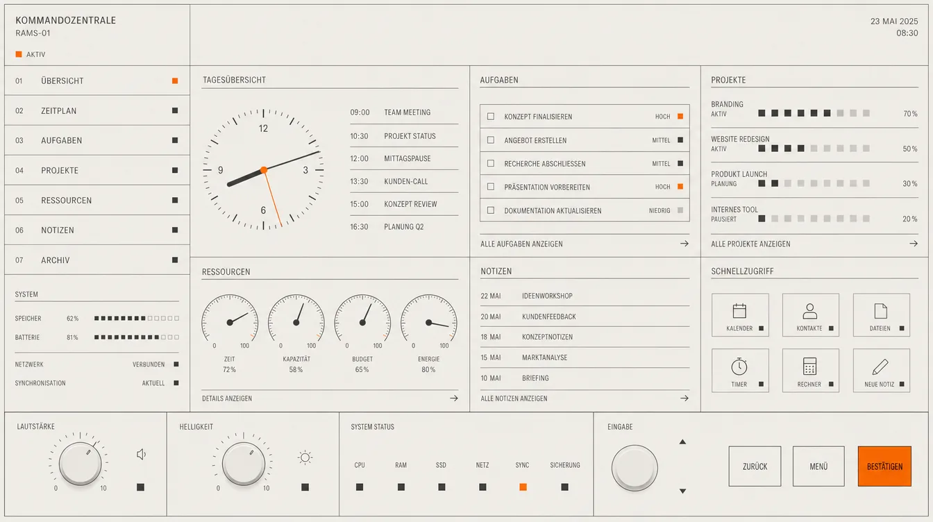
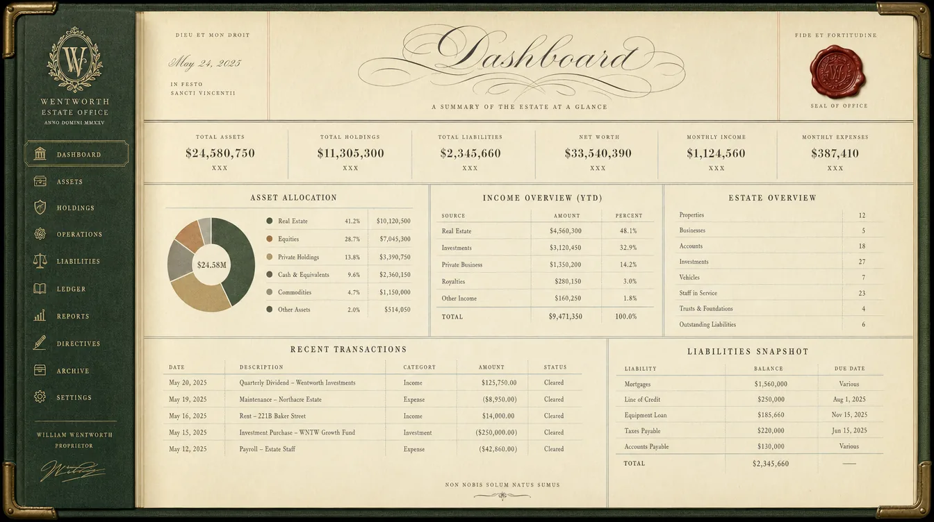
Six directions built on one idea — a personal HQ is a room you own and run things from — plus the audit that says why this is worth more than a repaint. Nothing is built yet. One decision unblocks the rest.
Where this stands
The warm direction was rejected. Restarted as futuristic.
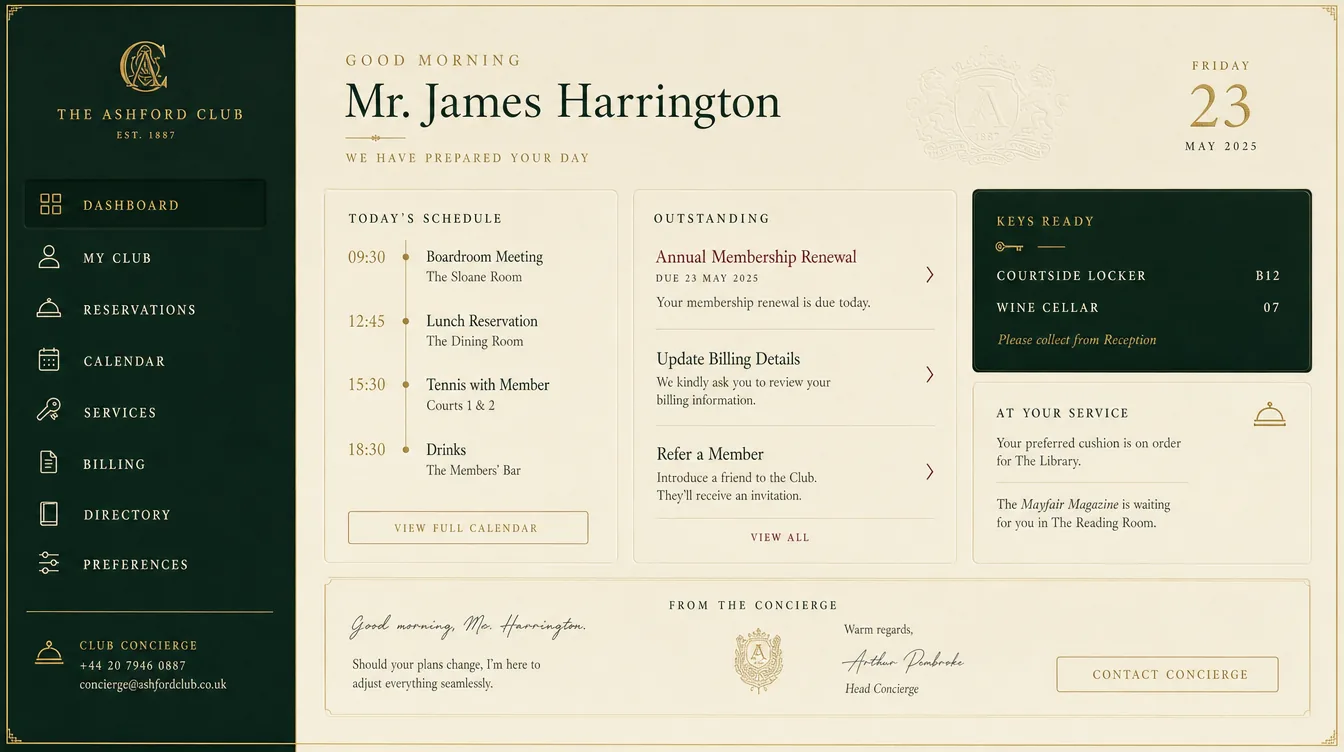
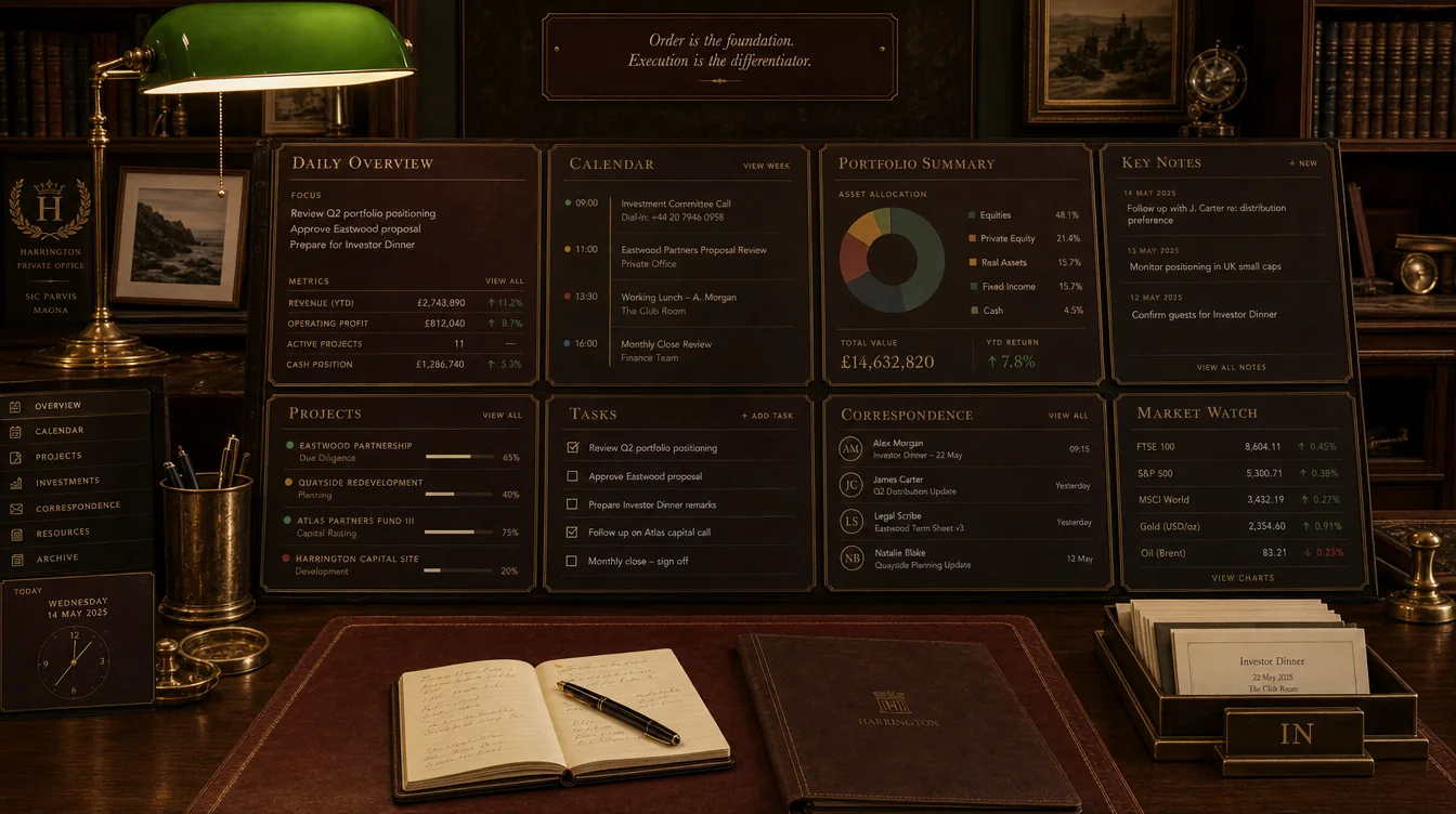
The Concierge Desk below was built, tested and reviewed — and then rejected on the thing that matters most: it does not look the way you want. That is a fair call and an early one, so it cost paint rather than plumbing.
It could not be adjusted into the new brief. Warm ivory, brass and a print serif are analog and editorial by construction; futuristic is the opposite axis, not a darker shade of the same one. So the visual direction restarted from scratch at precision instrument, dark ground.
Round 1 of that restart produced ten futuristic directions, four of them built and openable. You picked Obsidian and Schematic as the inspiration for a second round.
Round 2 put four new designs in front of eleven blind critics. Blueprint won 3–0 and you picked it, then asked for new colours, a different layout, and something more visually dynamic.
See round 3 — Blueprint recoloured, four ways → That page is the live decision. Everything below is the earlier work, kept as a record.
Built
What it looks like now.
Rebuilt on the tokens, integrated, tested and measured. Not deployed — this is a local preview. Desktop is 3,682px, down from 4,943. The phone view is 8,345px against 7,331 before; desktop is where this gets used, so that gap is stated rather than chased.
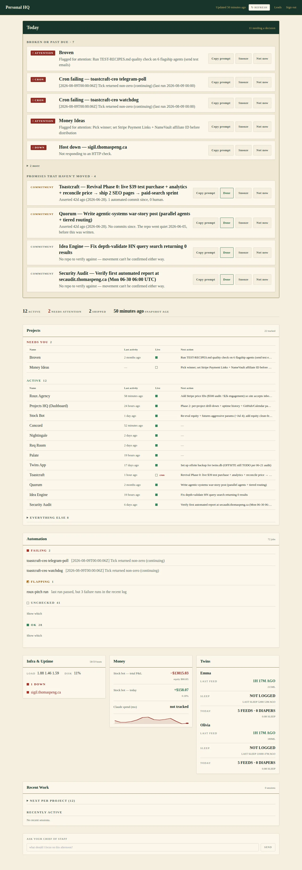

The second pass: bringing the room into the page
The first build kept the direction trapped in the masthead — the forest green never left the top bar, the serif was barely used, and brass appeared nowhere. It read as clean editorial rather than as a room. Four changes fixed that, each measured before it was made:
- The deep forest is now a text colour as well as a surface. It measures 11.49:1 on the ivory field, so panel headings and section labels carry the register, and it is gated by the same contrast tests as every other text colour.
- The TODAY rail gets a forest header strip and its own warmer ground, so the answer sits on a desk rather than being the first card in a stack of eight. That ground is the darkest warm surface the palette can carry — the two deeper sands tried put meta text at 4.41:1 and 4.18:1, under the 4.5:1 floor.
- Panel headings moved to the display serif. Tracked-out caps are the instrument voice, and they now belong to status labels only.
- Brass appears as the rule under every panel heading — structure, which is the only use the palette permits it.
Three economy fixes found while looking at it
- The TODAY item controls sat on their own row, so eleven items filled the whole viewport before any evidence appeared. Side by side with the text, cards went from 144px to 88px.
- Each card’s title began wherever its own badge happened to end, so no two rows in the rail shared a left edge. A fixed-width badge gutter is most of what makes it read as a board rather than a pile.
- The activity column shouted
2 MONTHS AGO— a fossil of the departures-board design, which made that column wrap to two lines on half the rows.
Two regressions caught by measuring, not by looking
Rewriting the stylesheet dropped two responsive utility classes, so the project board rendered its desktop table and its mobile card stack at every width. An undefined CSS class fails silently — nothing errors, the page just doubles. 4,943px → 8,294px.
And 41 unchecked jobs rendered a row each: 1,746px, two thirds of the automation panel, spent on a fact about the monitor rather than about any job. Exactly the mistake the old design made, reproduced in a lighter palette.
One accessibility bug fixed in passing
The copy-prompt button set outline: none and painted
its own blue outline on focus. That silently defeated the page’s double focus ring,
which exists because a single ring measures 1.60:1 against the forest chrome —
invisible. Focus is left to the global rule now.
The decision
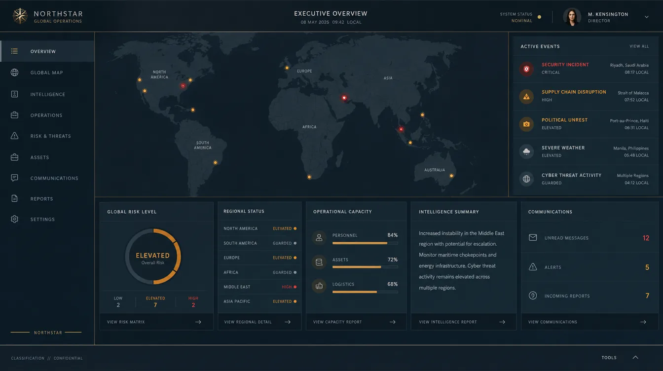
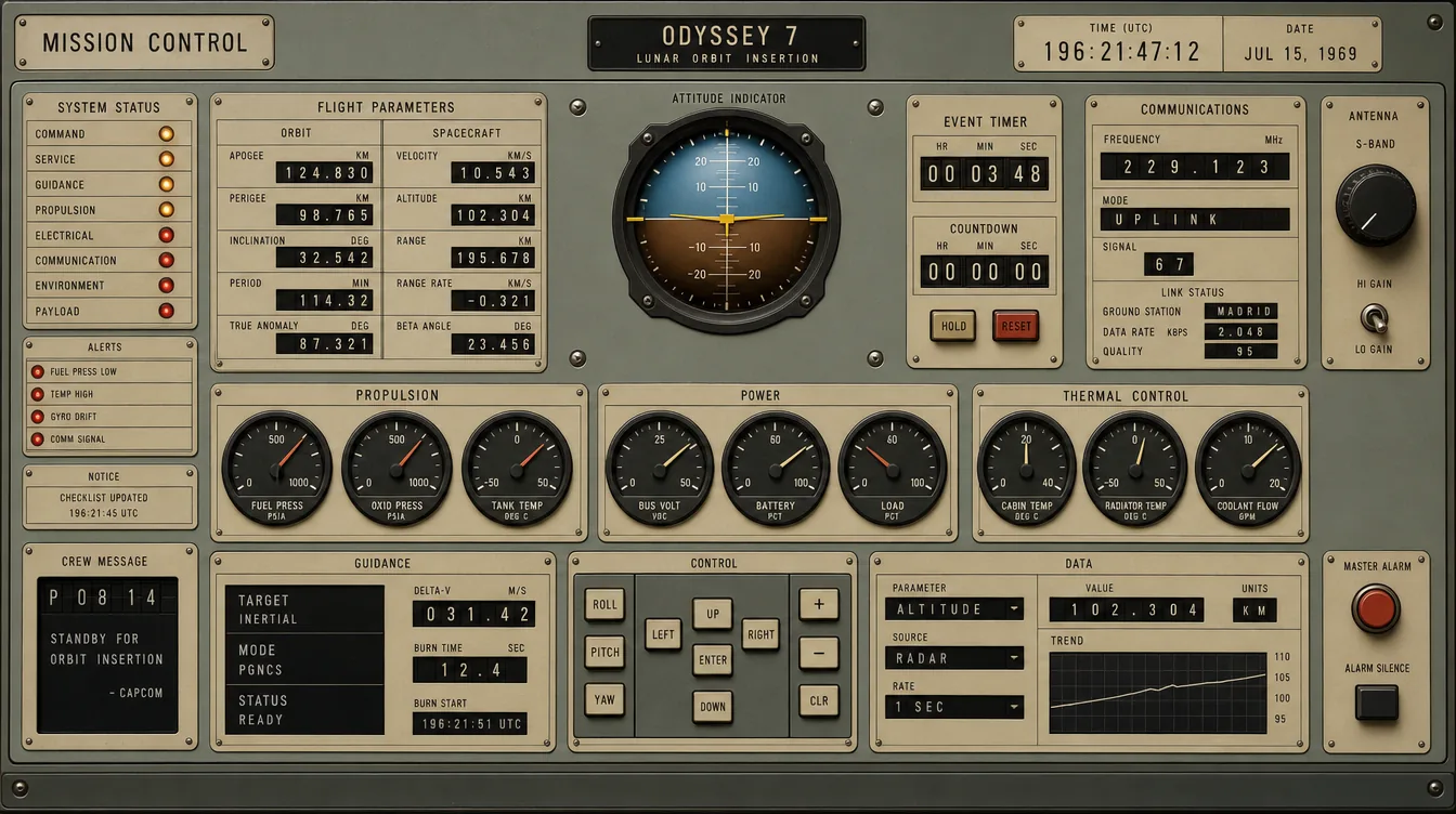
Pick a direction and I build it end to end.
My recommendation is Direction A, the Concierge Desk, with Direction B’s rational grid for the dense regions. A concierge desk exists to say “here is what needs you today, everything else is handled” — which is this page’s entire purpose, stated as hospitality rather than as monitoring. Its phone render made the point unprompted: it titled its lead card What needs you today.
Why it needs more than paint
The page does not take a position on what matters.
What happens after you pick
- Component tests first. There are currently no render-layer tests at all, so the honesty affordances are unprotected. They get pinned against the current design before anything changes.
- Real design tokens. Colour, type scale, spacing, radii, elevation — defined once, inherited everywhere, replacing the inline styles that let the current design drift.
- Rebuild, collapsing the duplication and cutting the dead panel.
- Preview published here for you to look at. The deploy stays your call.
Personal HQ redesign review · updated 9 August 2026 ·
built from branch worktree-redesign-2026-08-08. Nothing here is deployed;
the live dashboard is untouched.