dashboard.thomaspeng.ca · 11 August 2026
Futuristic:
ten directions, one pick.
The warm Concierge Desk was rejected — it is analog and editorial by construction, which is the opposite of futuristic. Axis reset to precision instrument, dark ground. Below: four built mockups you can open and scroll, and six image renders. Nothing is committed. Pick one and I build it properly.
Built, not rendered
Four real mockups — open them.
These are working HTML, not pictures: real type, real spacing, and the real data — all 22 projects, all 72 cron jobs, the four genuine failures, the −$13,855.70. That matters, because density is the actual design problem here and a mockup with five tidy rows solves a problem you do not have. Open each one and scroll it.
A — Operations Terminal
The densest of the four, and the only one that solved a problem the reviews raised:
automation rows cross-reference the items above them (“→ TODAY
01”), so one cron failure appearing in three places is linked rather than silently
tripled. Promotes “4 blind spots — sources this page cannot read” to a
headline counter. Dormant projects carry an explicit NOT MONITORED chip
rather than an ambiguous dash.
Risk: it is genuinely a lot. This is the one that most rewards daily use and least rewards a casual glance.
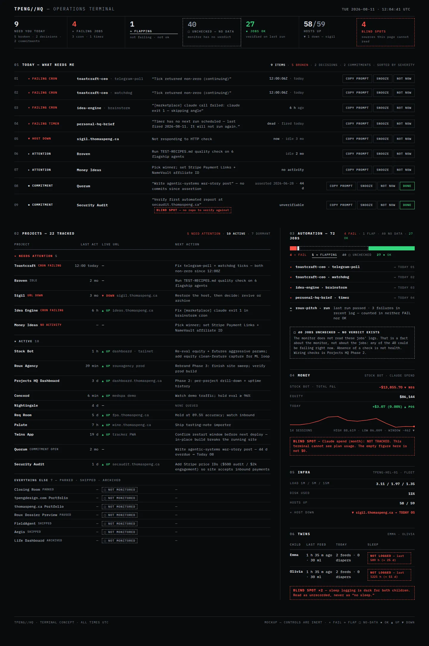
Its designer gave up: the “everything else” collapse — all 22 projects are shown, dormant rows compressed rather than hidden, on the principle that a terminal hides nothing. Also gave up any warmth in the Twins section: it gets the same ledger treatment as money. Projects with no recorded next step read NONE QUEUED rather than inventing work.
B — Refined Dark Product
The most livable. Quiet charcoal, one restrained accent, immaculate spacing — the Linear/Vercel language pushed forward. It is the easiest of the four to read at a glance and the least likely to tire you out. It also annotates its own chart: “thin segments enlarged to stay visible — counts below are exact”, which is an unusually honest thing for a dashboard to admit about its own graphics.
Risk: the safest of the four. Closest to “very good dark admin panel” rather than something you have not seen before.
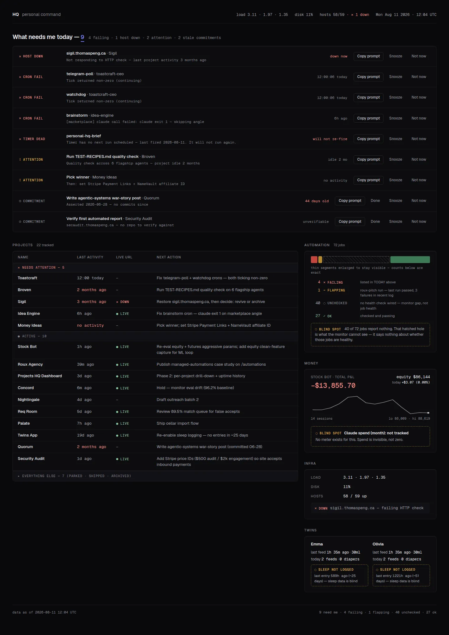
Its designer gave up: any hero chart — one small neutral sparkline only — and hover-revealed actions. All 33 action buttons are permanently visible, which costs quietness but keeps nothing behind an interaction. One electric accent appears exactly twice on the whole page.
C — Mission Telemetry (my recommendation)
Ground-station instrumentation. The reason I recommend it is not the look, it is that
the look solves the hardest problem this page has: telemetry design states
provenance natively, so every value carries SRC SYSTEMD JOURNAL · AGE 7 MIN
underneath it. This dashboard has spent its whole life trying to distinguish
“measured” from “asserted” — here that distinction is
the visual language rather than a badge bolted on. It also opens with a
STATION VERDICT: DEGRADED, and says of the twins’ missing sleep data:
“the log is silent, not the baby.”
Risk: the most opinionated. If the technical voice grates, it will grate daily.
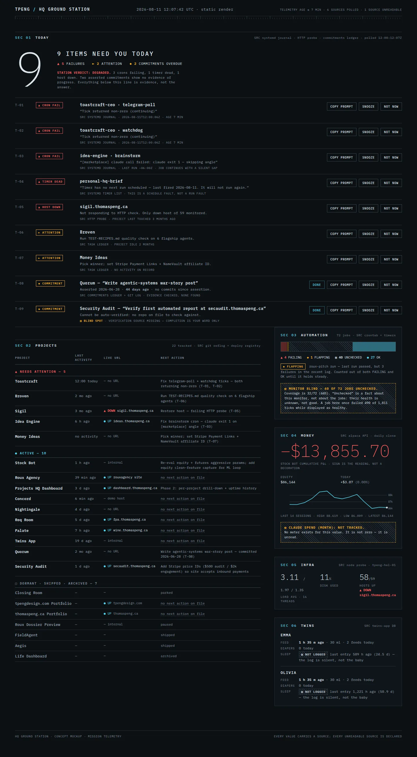
Its designer gave up: all interactivity (zero JavaScript), per-project drill-down, and every kind of glow or motion. The “everything else” group is muted rather than collapsed, to avoid hiding a table inside a disclosure. The verdict headline is set at 168px — scale contrast is the whole argument.
D — Obsidian
The most restrained and the most expensive-looking. Near-black, one ember accent, and a rule it states in its own footer: “one accent — if it isn’t ember, it can wait.” Because nothing else is coloured, the one thing that needs you is genuinely the first thing you see.
Risk: restraint costs density. This is the calmest and the least information-per-inch of the four.
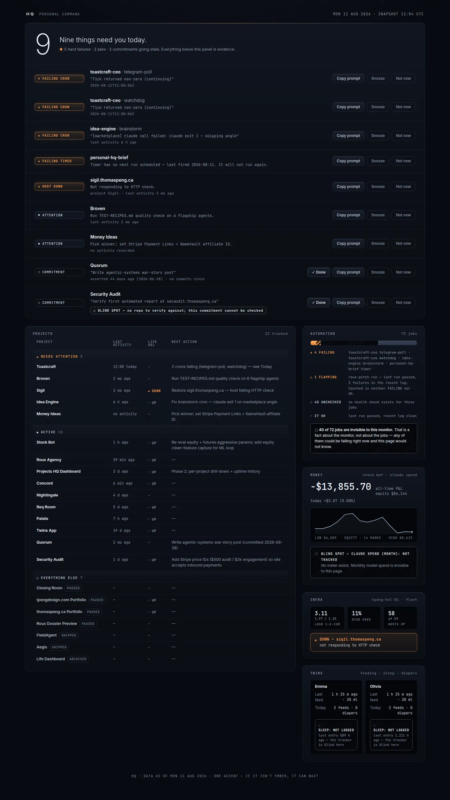
Its designer gave up: interaction polish, and reports touch targets at ≥30px rather than the 44px the built dashboard standardised on (still above the 24px accessibility floor). The ember accent is budgeted exclusively to hard failures — asks and commitments speak in grayscale.
All four independently invented the same thing
Working in isolation, with no knowledge of each other, every one of the four designers decided that absence needs its own visual vocabulary — a hatched or dashed “hole”, distinct from both good and bad, so that a monitoring gap can never read as calm. Four independent answers converging is the strongest signal in this whole round. It is worth noting that the currently built dashboard does not do this: it marks unchecked jobs with a hollow outline dot, quieter than anything these four were willing to accept. Whichever direction wins, that treatment comes with it.
Image renders
Six directions, generated.
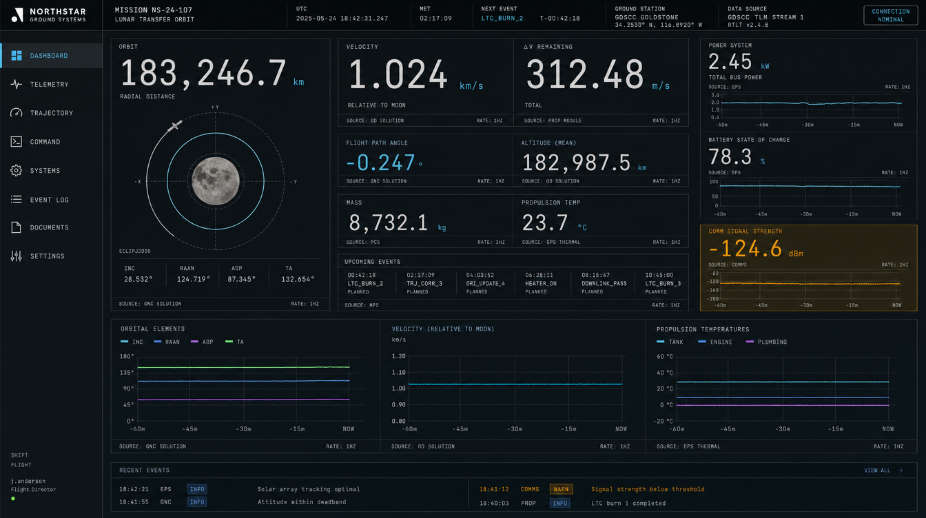
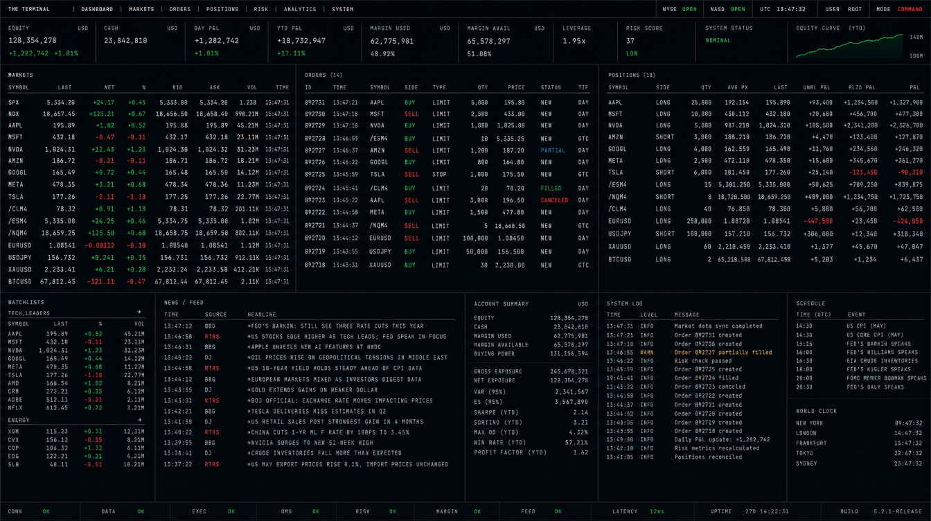
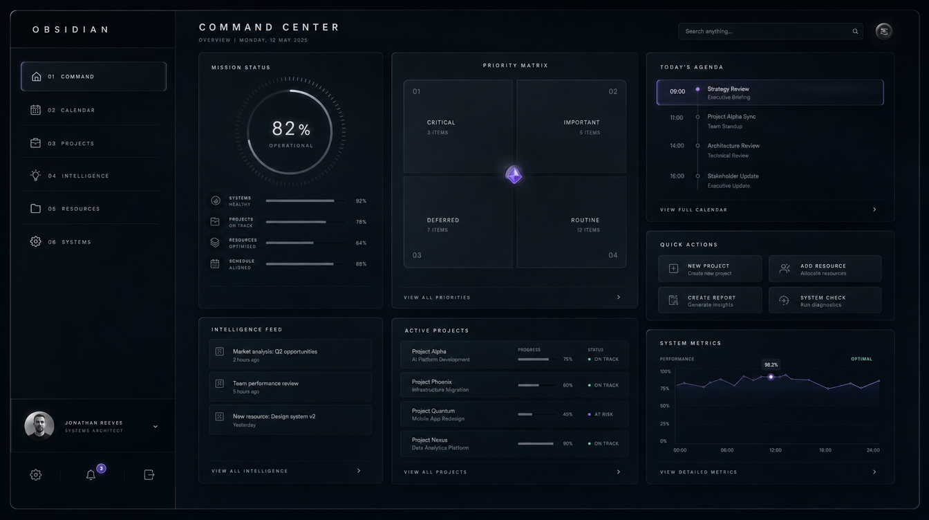
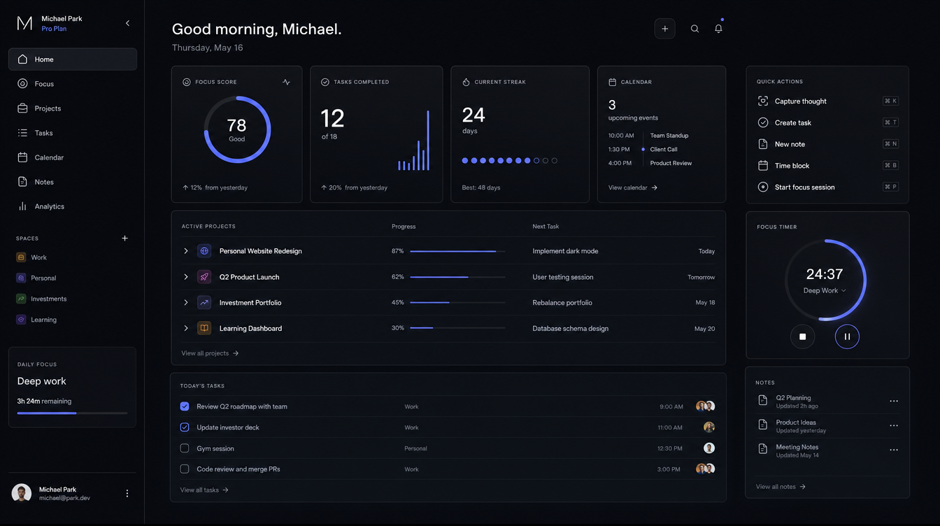
These lock a look, never a spec — every word in them is invented, so judge the feel and ignore the text. I have said plainly which ones I think are weak; a render that looks good and would collapse under real data is worse than no render.
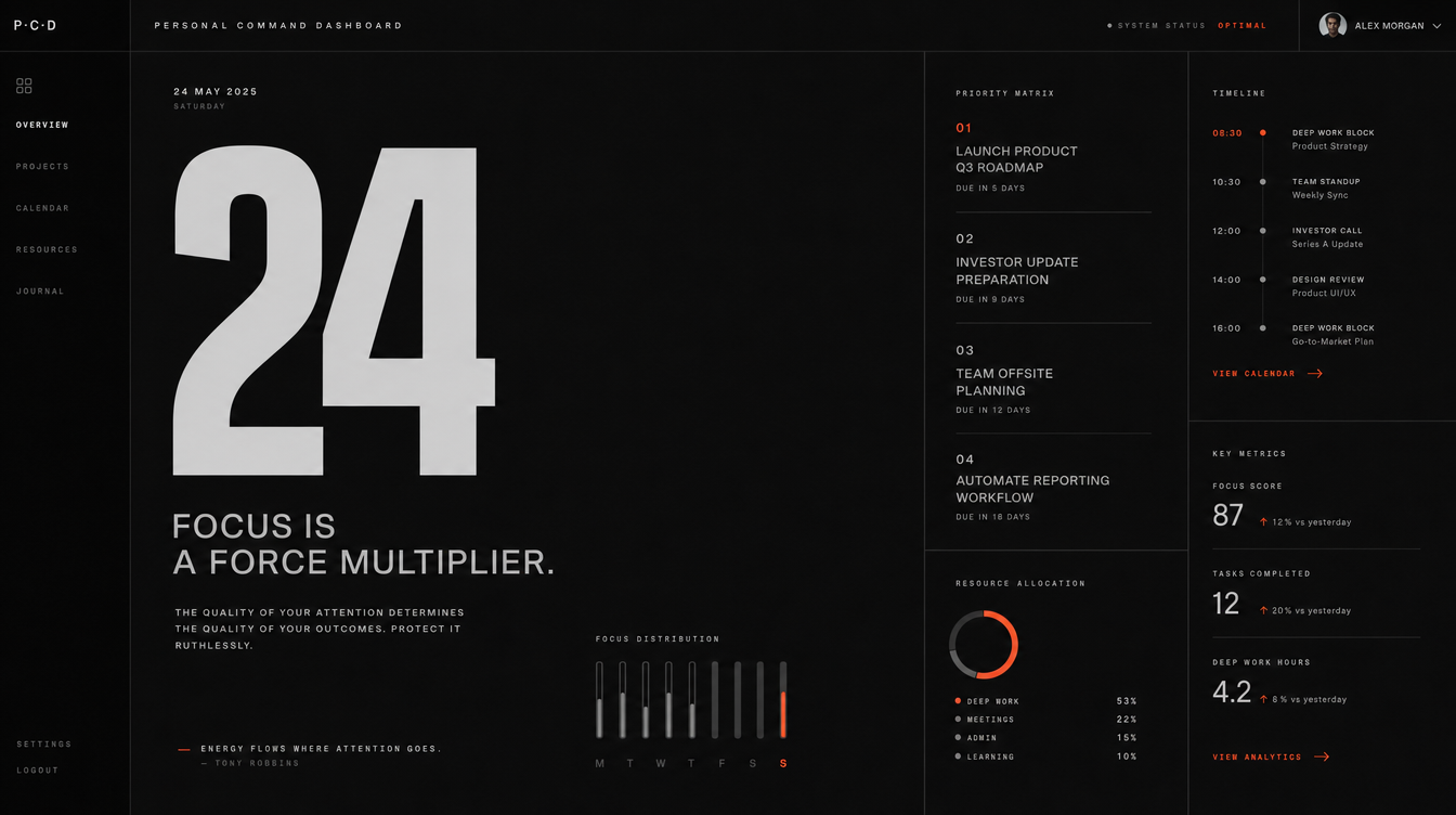
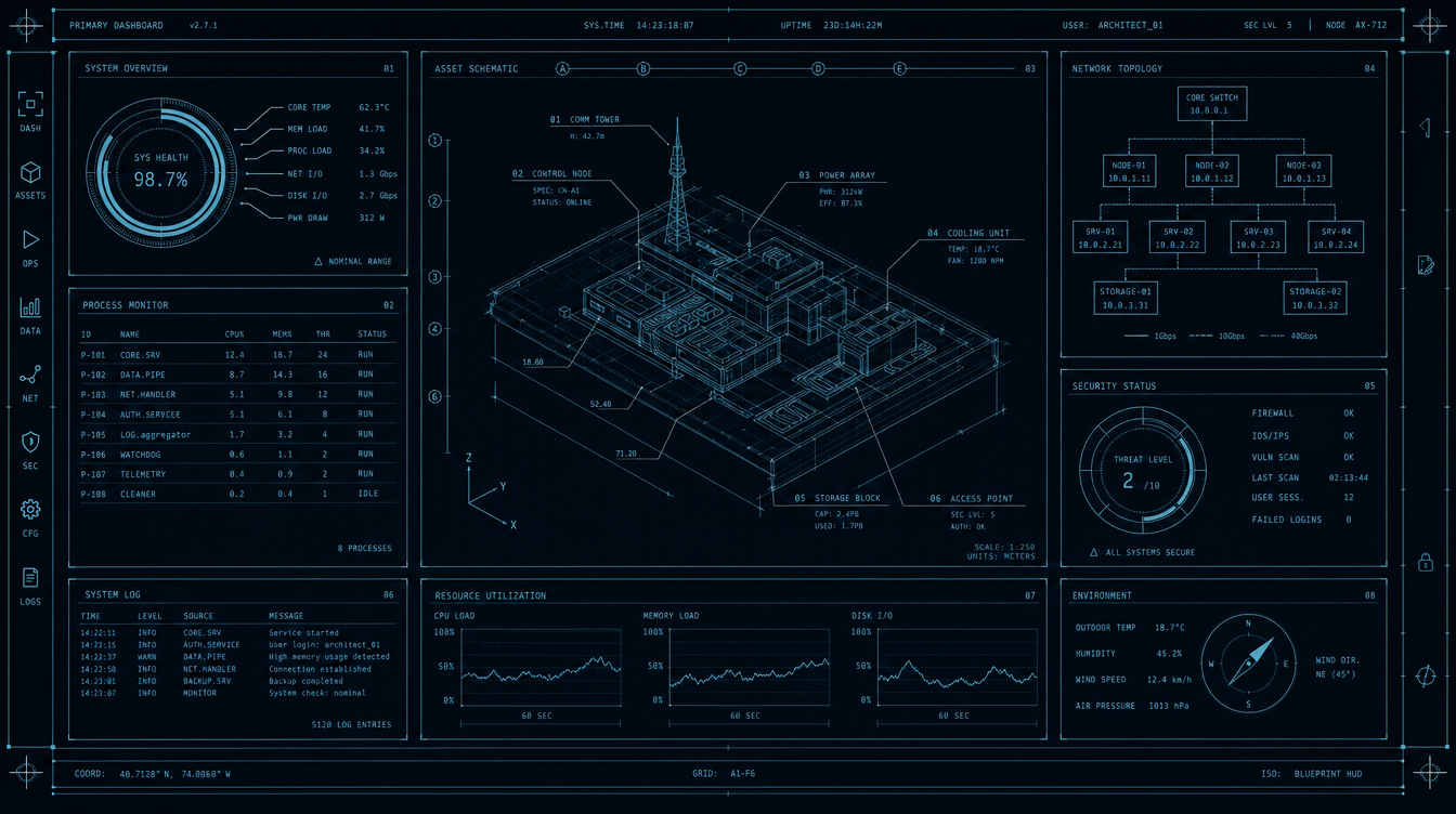
What the renders were actually good for
One idea, from the telemetry render: it printed
SOURCE: OD SOLUTION · RATE: 1HZ under every number. That is provenance
as native visual language, and it is now the spine of built option C. The other five mostly
demonstrated the failure modes — invented metrics, focus scores, streak counters and
donut gauges that no data here would ever fill.
Your call
Pick one and I build it end to end.
My recommendation is C, Mission Telemetry, for the provenance argument above — it is the only one where the aesthetic and the honesty requirement are the same thing. If it reads as too technical for something you open every morning, D is the calm version of the same instinct, and A is the version for someone who wants everything visible at once.
All four are throwaway mockups. Whichever you pick gets rebuilt properly on the real token layer, with the 321 tests and the honesty affordances intact — none of which is lost, since all of that work sits underneath the paint.
Personal HQ redesign · futuristic round · 11 August 2026 · concepts are static mockups; controls in them are inert. The live dashboard is untouched.