Step one · pick one
Six directions for
a personal HQ.
All six answer one question: what does it feel like to sit in a room you own and run things from? These are Higgsfield renders used only to lock a look — every word inside them is invented, so judge the light, the type and the material, and ignore the text.
Before
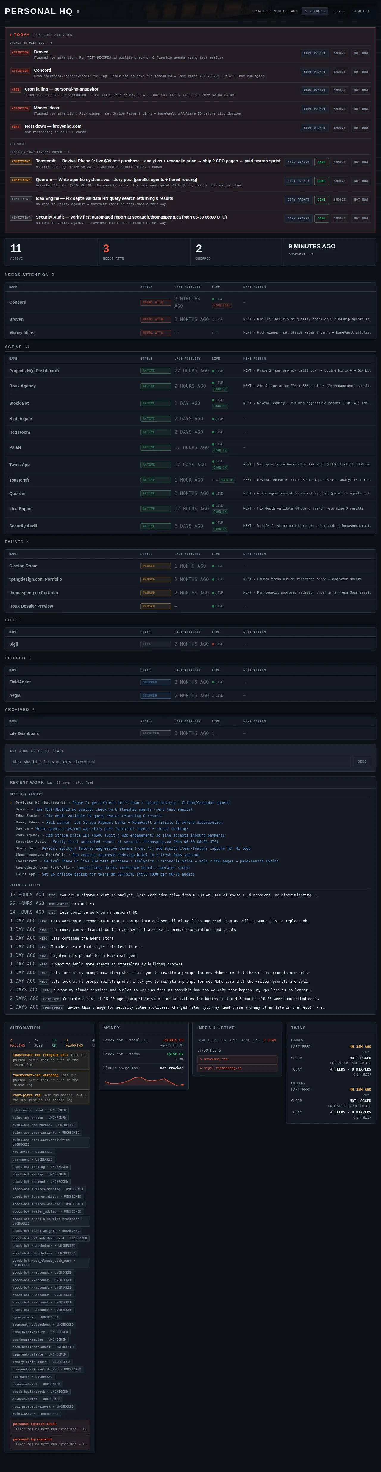
The current design
A dark airport departures board: near-black ground, condensed caps, monospace body, phosphor status lamps. Internally consistent, and not a place that belongs to anyone.

Direction A · recommended
The Concierge Desk
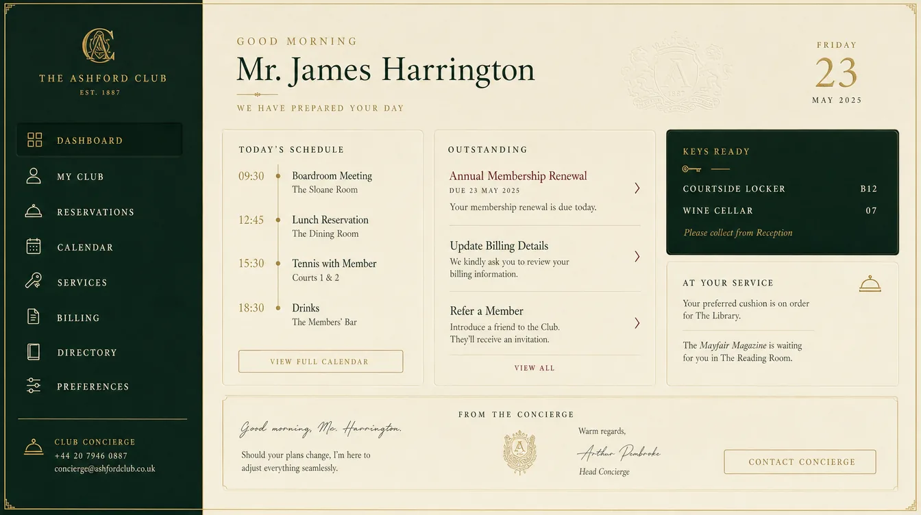
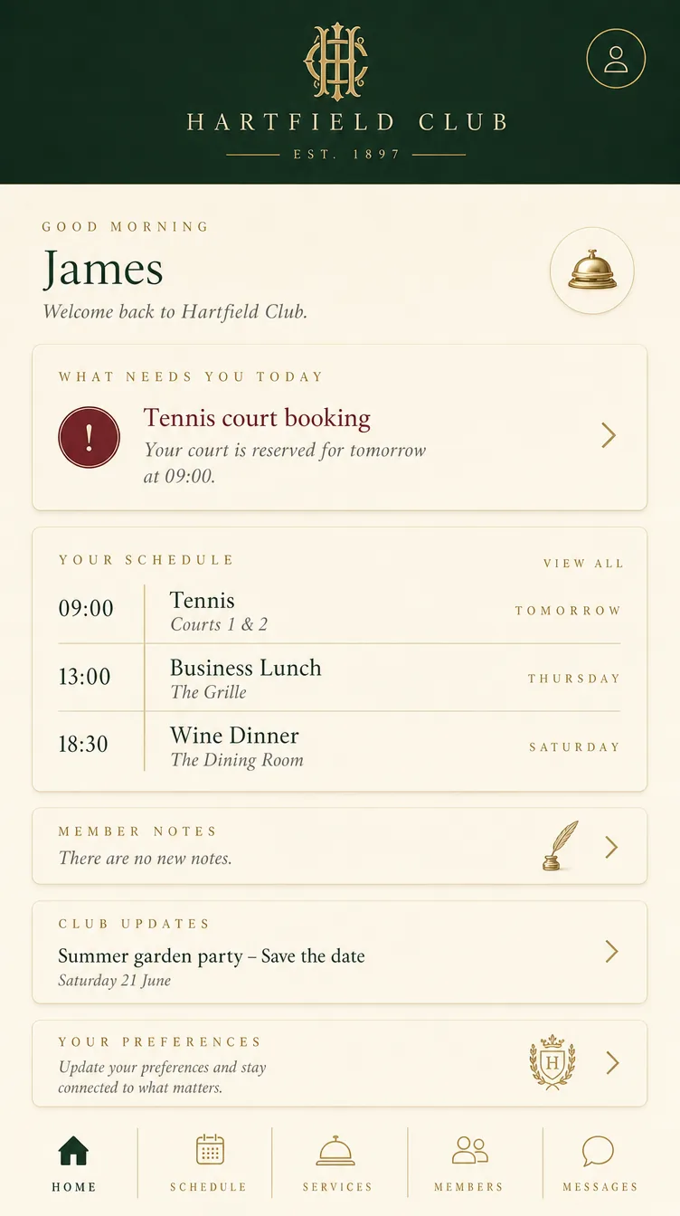
A private club’s front desk. Deep forest green chrome around a warm ivory field, gold-leaf hairlines, letterpress serif headings in small elegant caps, a deep claret spent once on the urgent thing.
This is the one whose voice matches the job. A concierge desk exists to say “here is what needs you today; everything else is handled” — which is the dashboard’s entire purpose stated as hospitality rather than as monitoring. The phone render made the point without being asked: it titled its lead card What needs you today.
It also solves the thing the current design gets wrong. Dark green chrome makes it feel like a place, while the data sits on warm ivory where sixty rows stay legible. And the claret is unused elsewhere, so it is available to mean exactly one thing: this is on fire.
Where it breaks: the register tips into butler cosplay if the copy goes flowery. I would take the layout, the materials and the restraint — and keep the words plain. No “Good morning, sir”.
Cost to build: Medium — a serif display face, a text grotesque, green/ivory/gold tokens and a hairline rule system. No textures, no skeuomorphism. About a day and a half.
Direction B · the rational one
The Instrument
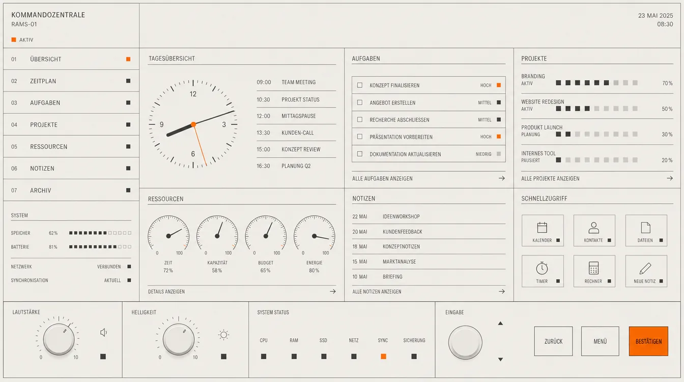

A personal command centre built like a well-made Dieter Rams object. Warm off-white, precise dark grey type, a single signal orange, numbered sections, fine hairline rules and small square indicator lamps.
The most capable of the set. Look at the phone view: ten numbered sections on one screen, every one legible, nothing shouting. This is the direction that would absorb seventy automation jobs and twenty-two projects without strain, and it earned its own title — it called itself Command Centre.
It reads as an object you own rather than software you rent, which is a different route to “personal HQ” than the club desk takes: ownership through precision instead of through hospitality.
Where it breaks: it is cooler and less characterful. If what you want is a room, this is a very good panel on a wall in that room.
Cost to build: Low — one typeface, no gradients, no shadows, no radii. The numbered-section grid does most of the work. About a day.
Direction C · the heaviest
The Estate Office
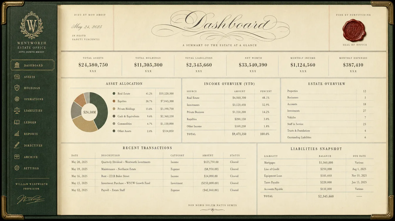
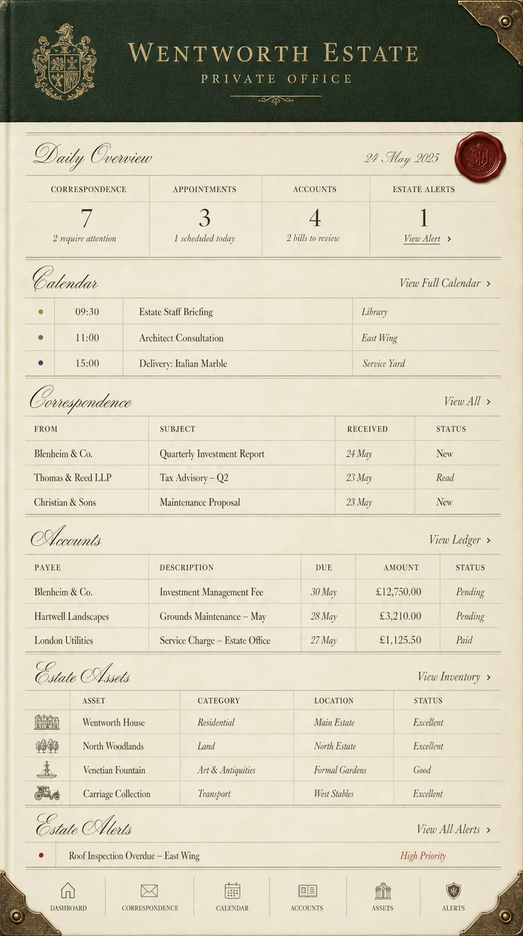
A private estate office. Dark green cloth binding, heavy cream ledger paper, copperplate headings, ruled columns in iron-gall ink, aged brass corners and a wax seal.
The strongest sense of permanence and of running something substantial. The ruled ledger tables are genuinely the right form for dense rows, and the register of “everything one person owns and runs” maps neatly onto a project board.
Where it breaks: it is the most pastiche-prone of the three. The coat of arms and the copperplate are doing a lot of work in this render, and both are exactly the parts that would look silly above a list of cron jobs. Strip them and it converges on the concierge desk.
Cost to build: High — needs a script or copperplate display face, corner-fitting details and paper treatment to avoid looking like a certificate. Around two days.
Direction D · the warmest
The Study
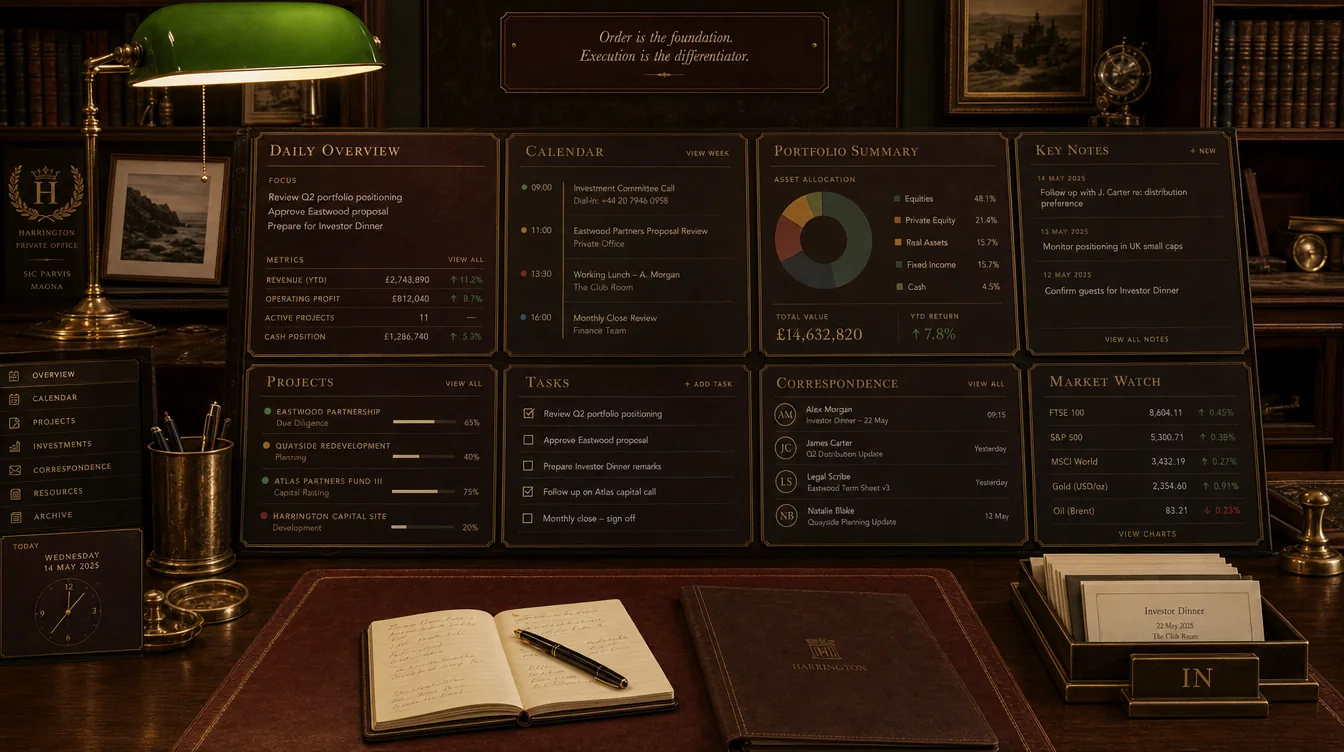
A private study: walnut and oxblood leather, the pool of light from a green banker’s lamp, aged brass, panels set like inlaid blotters and card holders.
The most inhabited and the most obviously somebody’s. Beautiful, and the warmest answer to “personal HQ” in the whole set.
Where it breaks: it is a photograph with panels floating on it. Reproducing that in CSS means either a large photographic background — which fights every piece of text placed on it and is expensive on a phone — or abstracting it until it is just a dark warm card system. I would only take it if you actively want a background image.
Cost to build: High — a photographic or generated backplate, plus careful contrast work to keep text legible over it at both widths. Around two and a half days, with real accessibility risk.
Direction E · dark
The Situation Room
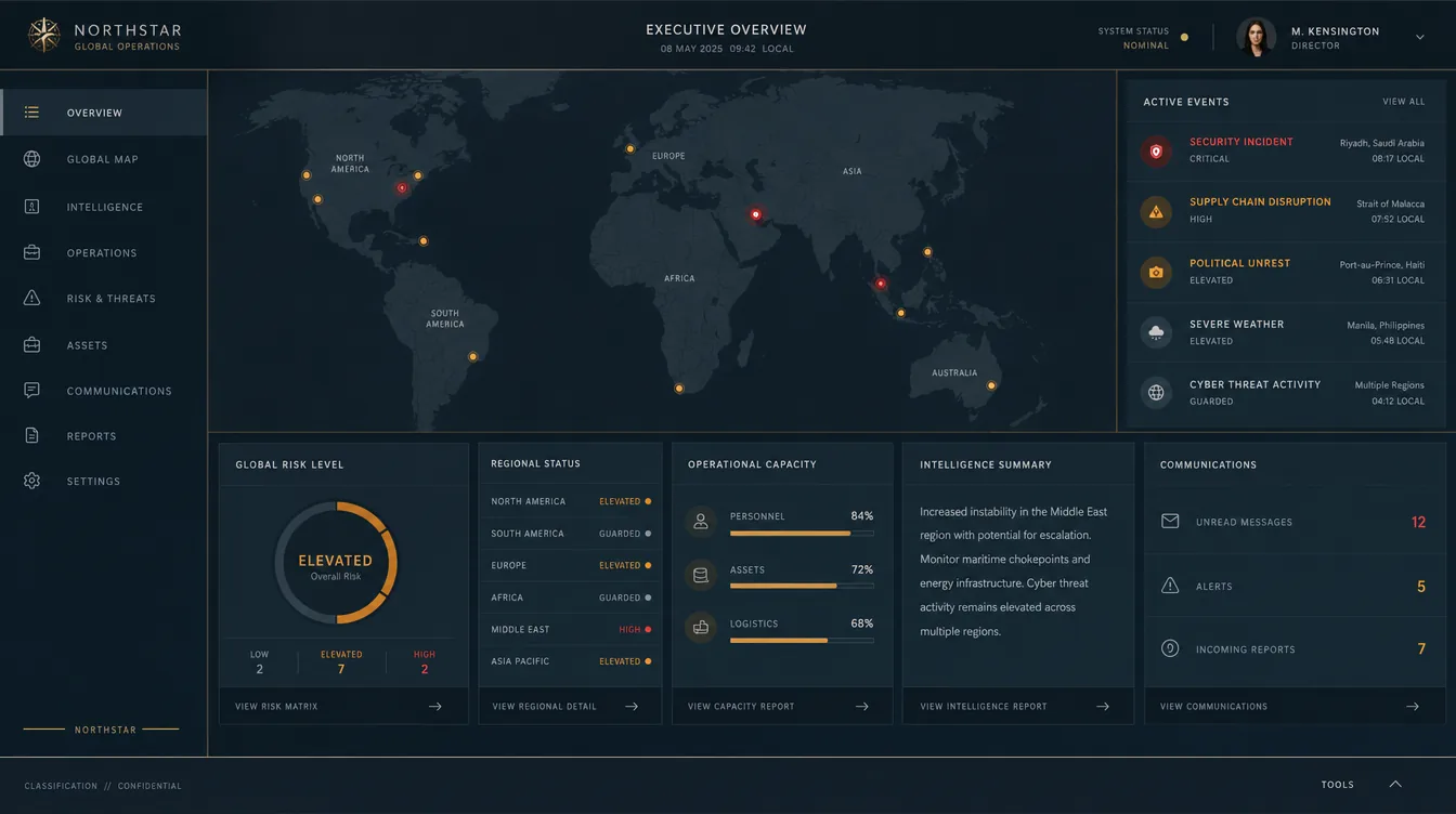
Charcoal-blue surfaces, a muted map held far back, warm white type, restrained amber and red indicators, brushed steel and a thin brass hairline.
Handsome and calm. But it reads institutional rather than personal — this is a company’s operations centre with a director’s photo in the corner, not one person’s HQ. The map is also decorative here; your data has no geography.
Cost to build: Medium-high — and I would not recommend spending it. Included for completeness.
Direction F · the literal one
Mission Control
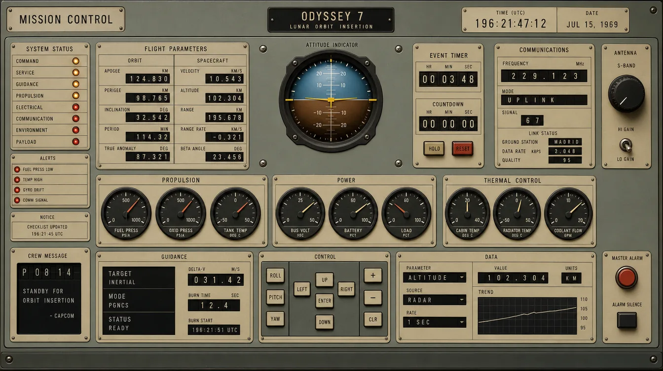
An Apollo-era console: grey-green panels, engraved label plates, machined bezels, amber and red lamps, real dials.
The craft is remarkable and it is the most literal reading of “command centre”. It is also a spacecraft, not a home for text. Every dial is a fixed shape that cannot hold a project name, so the density this page needs has nowhere to go — and full skeuomorphism in CSS ages badly and is expensive to get right.
Worth stealing one thing: the engraved label plate and the small indicator lamp are a superb way to mark status without colour alone.
Cost to build: Very high — bezels, dials and plates are all bespoke assets. Not recommended as a whole.
My recommendation
The Concierge Desk, with the Instrument’s grid underneath it.
Direction A is the pick. It is the only one whose voice matches what the page is for: a concierge desk exists to tell you what needs you today and to signal that everything else is handled. Green chrome around an ivory field makes it feel like a place while keeping sixty rows of data legible, and the claret is spent nowhere else, so it can mean exactly one thing.
Direction B supplies what A lacks: a numbered, hairline-ruled grid that absorbs density without shouting. Same warm ground, compatible accent. I would use A for the shell, the masthead and the TODAY answer, and B’s discipline for the automation and project tables.
And one detail worth stealing from Direction F: the engraved label plate with a small indicator lamp is an excellent way to mark status without relying on colour alone — which matters, because colour alone is not an accessible signal.
First round — not chosen
Seven that were too format-led.
The first round asked “what should a personal command centre feel like” and got back formats: a newspaper, a corporate report, a journal, a SaaS product, a poster, an astronomy app, a zine. Several are good-looking. None of them feels like a headquarters, which was the note that produced the round above. Kept here as the record, and because two of them have details worth borrowing.
Direction 01 · light · recommended
Broadsheet
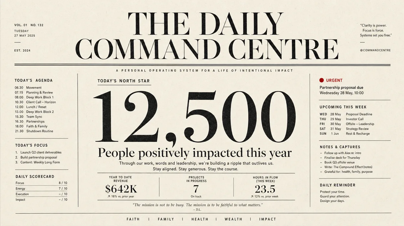
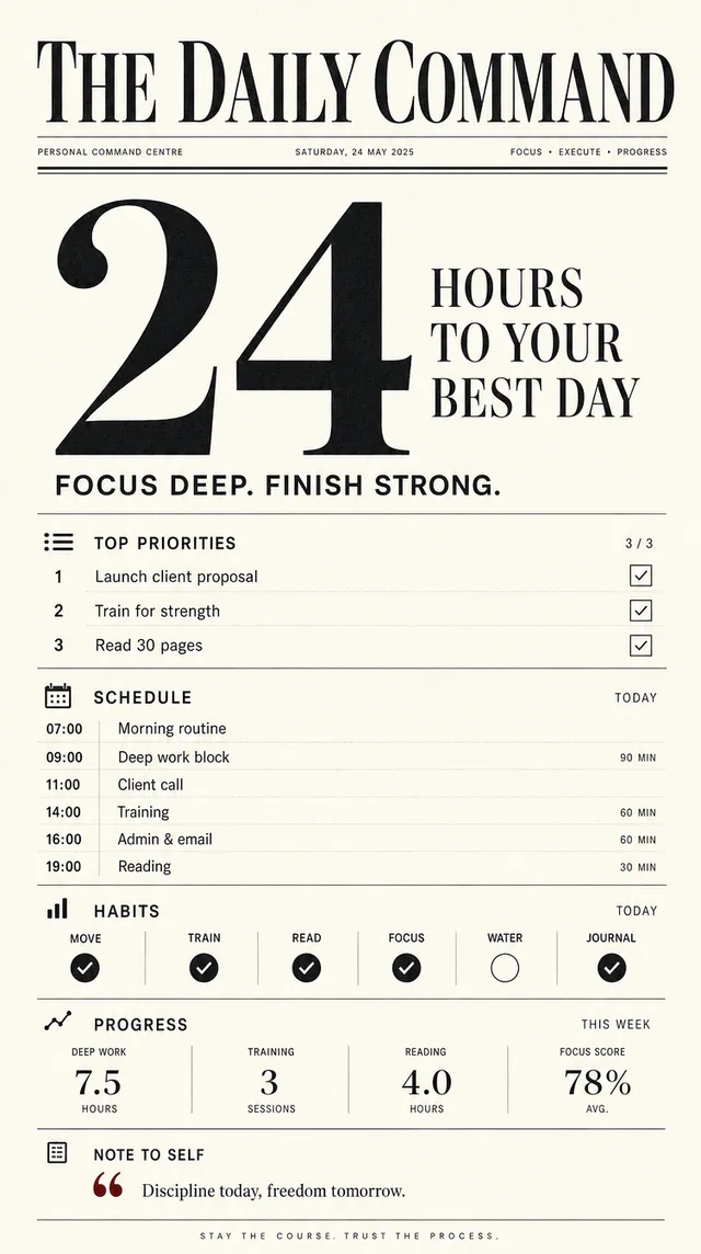
A newspaper front page. Warm ivory stock, a high-contrast didone masthead over a double rule, one enormous lead numeral set as a pull-quote, and narrow columns of small grotesque type divided by hairline rules. A single oxblood red, spent only once, on the thing that is actually urgent.
This is the only direction whose structure already solves the problem. A front page exists to rank many items of unequal importance on one surface and still leave you in no doubt what the lead story is. That is exactly what this dashboard has to do — one answer to “what needs me today”, everything else demoted to evidence. The others are skins. This one is an argument.
Where it breaks: display serifs get fragile at small sizes, so the phone view has to switch to the grotesque earlier than looks natural. It also turns precious fast if the copy is not tight.
Cost to build: Medium — two typefaces, a strict column grid, a hairline rule system. No new component types. Roughly a day and a half.
Direction 02 · light
International Style
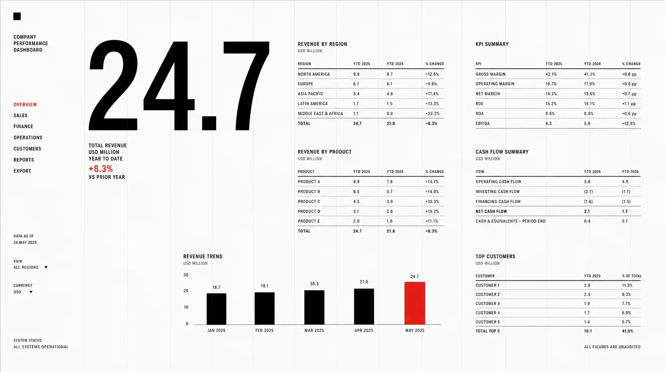
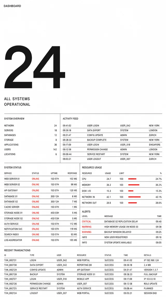
Pure white, a strict visible grid, black neutral grotesque with exactly one signal red. Enormous deliberate whitespace at the top, then dense tables with perfect optical alignment. Müller-Brockmann discipline applied to software.
The direction that handles volume best. Seventy-odd automation jobs and twenty-two projects are its native form rather than a compromise, and reserving red for a single meaning makes an alarm genuinely unmissable.
Where it breaks: it is cold. The render reads as a corporate finance report and there is nothing personal in it. If that is a feature for you, this is the strongest pick after the broadsheet.
Cost to build: Low — one typeface, no shadows, no radii, no gradients. Fastest to build and hardest to get subtly wrong. About a day.
Direction 03 · light
Analog Desk
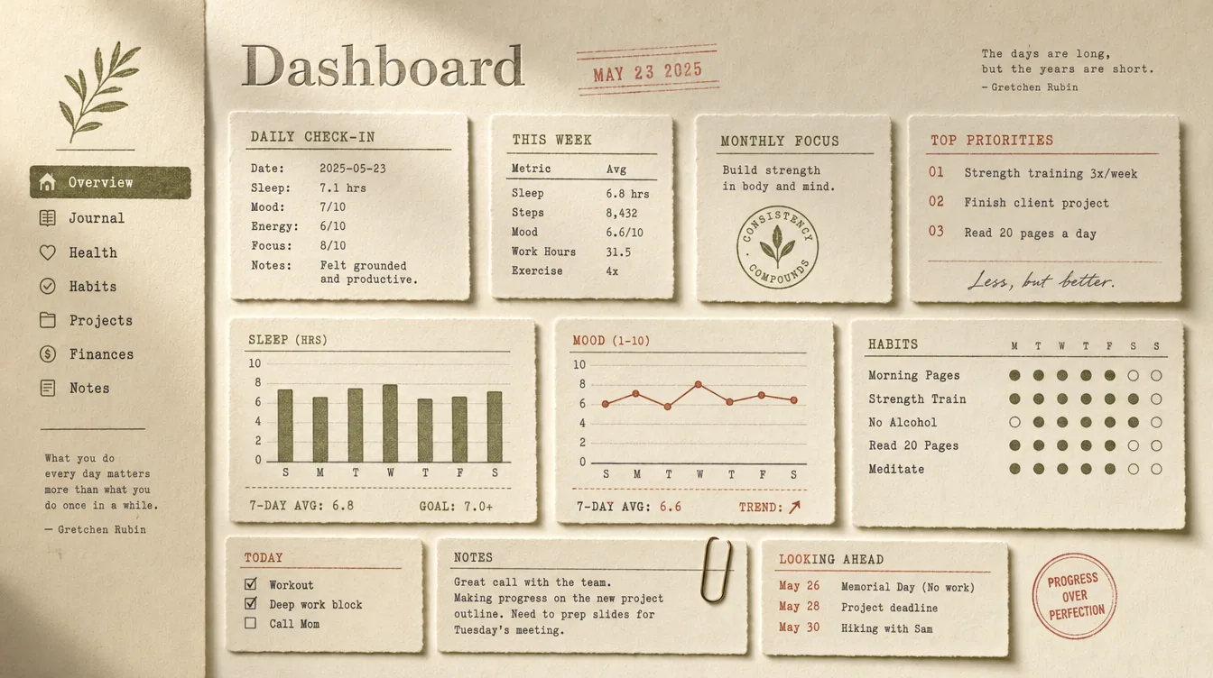
Cream and oatmeal paper, letterpress-debossed headings, index-card panels with deckled edges, a rubber-stamped date in faded red, typewriter monospace for data. Muted olive, rust and ink.
The warmest and most personal of the set, and the least like anything else you run.
Where it breaks — and this is an objection, not a caveat: this page’s job is signalling alarm, and an alarm needs a saturated, unambiguous colour. This palette is muted by construction; the loudest thing it can say is a faded stamp. Paper texture behind sixty rows also stops being tactile and starts being noise. Beautiful, and arguably wrong for the job.
Cost to build: High — texture assets, card treatments, a third class of typeface. Around two and a half days, plus the signalling risk above.
Direction 04 · light · the safe one
Luminous Glass
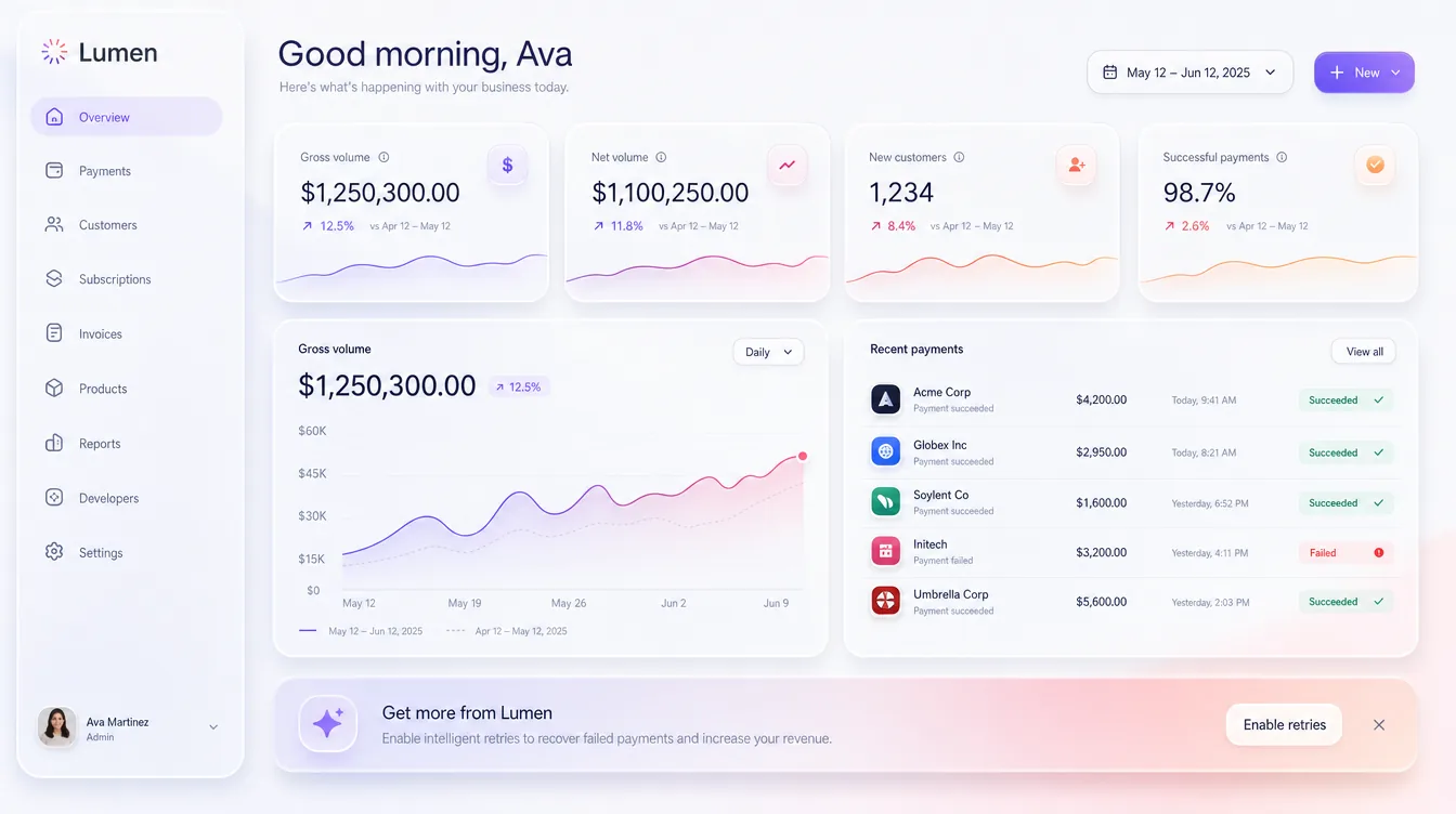
Soft near-white, frosted glass panels with real depth, a violet-to-coral gradient accent, large friendly numerals.
Included so you can reject it deliberately rather than by omission. Given a free hand the model produced a near-exact Stripe clone — sidebar, metric cards, “Good morning, Ava”, an upsell banner. That is the tell. This is what a dashboard looks like when nobody decides anything. The craft is high and the result is forgettable.
Cost to build: Medium — the glass and elevation system is fiddly to tune and expensive to render on a phone.
Direction 05 · saturated
Brutalist Poster
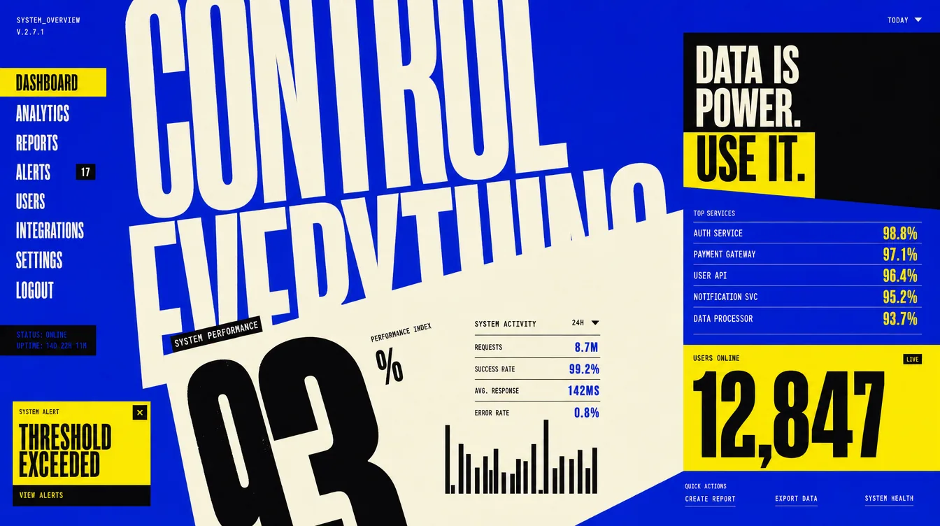
A single field of electric cobalt, oversized condensed type running past the frame, acid yellow and black used as graphic weight rather than decoration, deliberate asymmetry and overlap.
Its alert language is the best of the seven. “THRESHOLD EXCEEDED” in a hard yellow box is exactly the register a flapping cron job deserves, and nothing here can be politely ignored. Worth stealing even if you pick another direction.
Where it breaks: exhausting across sixty rows, and the diagonal overlap would not survive contact with real variable-length data — that composition works because the text was invented to fit it.
Cost to build: High — an extreme type scale needs a variable condensed face and careful overflow handling. About two days.
Direction 06 · dark
Observatory
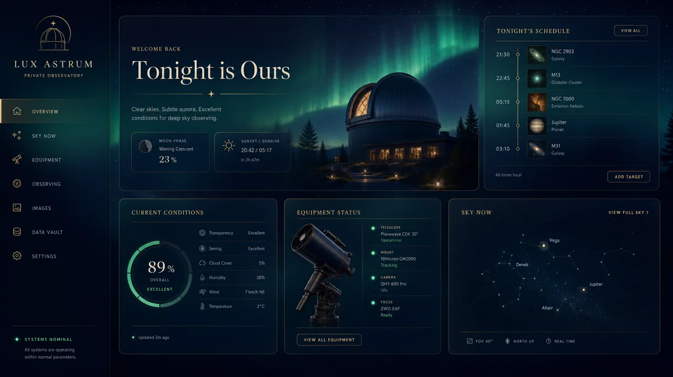
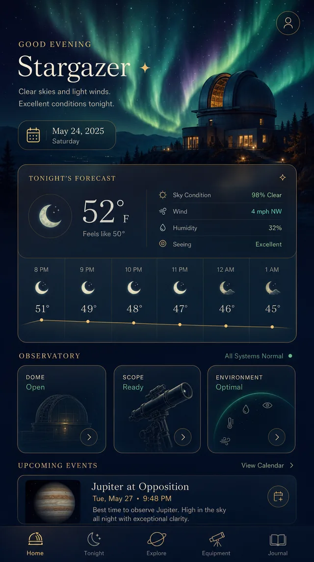
Midnight indigo with a slow aurora bloom, glassy cards edged in fine gold hairlines, an elegant serif for headings, emerald and amber as jewel points.
The one dark direction, and emphatically not a departures board — warm gold and high-contrast serif instead of phosphor-green terminal. If the current design’s problem was that it felt like infrastructure rather than something of yours, this fixes that without giving up the dark.
Where it breaks: the illustrated hero does most of the work here and does not survive onto a data page. Strip it and what remains is a competent dark card system — less distinctive than this render makes it look.
Cost to build: Medium-high — gradient bloom background, glass cards, a gold hairline system. About two days.
Direction 07 · light · the startling one
Risograph Zine
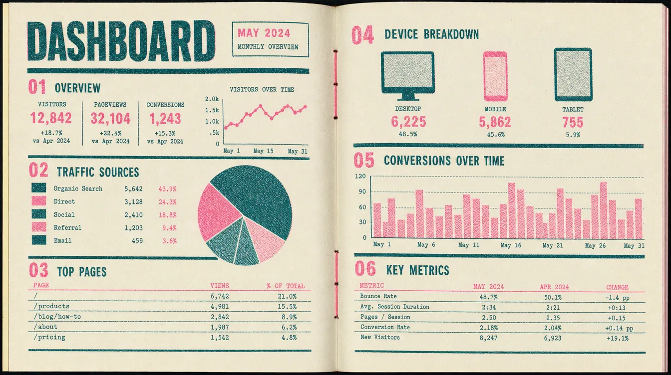
Uncoated newsprint ivory, two-colour risograph in fluorescent pink and deep teal, visible misregistration and ink mottle, coarse halftone fills, hand-numbered sections.
The one that startles. The two-ink constraint is a genuine design system rather than a texture: with only two colours available every element has to earn its emphasis, which is precisely the discipline this page has been missing.
Where it breaks: fluorescent pink is legible as an alarm but tonally jokey — hard to take a failing production cron seriously in it. And misregistration is charming once and irritating daily.
Cost to build: High — halftone and mottle need generated texture assets and careful layering. Around two and a half days.
Method
Thirteen directions across three rounds. Two models were run against identical briefs rather
than assuming a winner: gpt_image_2 produced credible interfaces, while
nano_banana_2 returned a photograph of a physical newspaper and an abstract 3D
render — neither an interface. Everything here therefore stands on
gpt_image_2 at high quality.
Divergence does not come from asking for it. Asked for six different dashboards, the models converge on the same competent one — round one’s Direction 04 came back as a near-exact Stripe clone, greeting included. What produced real spread was naming the exclusions (none may be dark, none may be a departures board) and giving explicit permission to miss.
What produced the right spread, though, was none of that. It was a one-line correction — “make it feel more like a personal HQ” — which replaced an abstract instruction to diverge with a concrete thing to be. Worth remembering: the useful brief names the subject, not the amount of variation.
Personal HQ redesign review · 8 August 2026 ·
built from branch worktree-redesign-2026-08-08. Nothing here is deployed;
the live dashboard is untouched.