dashboard.thomaspeng.ca · 11 August 2026
Round 3:
Blueprint, four ways.
You picked Blueprint and asked for new colours, a different layout, and something more visually dynamic. Its designer had explicitly sacrificed all three — zero animation, all line-work, one accent spent only on failure. So this is not a tweak. Four designers re-answered the question with the winning structure held fixed and everything visual thrown open.
The method
What was nailed down, and what was not.
Held fixed — these are the five things three blind critics named when Blueprint won 3–0. Break one of these and the design stops being the one you chose:
- The six-box stat strip near the top, so the day is answerable at a glance.
- The day’s items grouped into failures, decisions and commitments with their own subtotals — not one flat list.
- Numbers dimensioned like a technical drawing, with leader lines and extents.
- Absence drawn as a third vocabulary — hatched voids distinct from both good and bad — with the 40 unreadable jobs kept as a major object.
- The title block: drawing number, revision, scale, sheet.
Thrown open: the entire colour system and the layout rhythm. Each designer worked alone, without seeing the others, on the real data — all 22 projects, all 72 cron jobs, the five genuine failures, the −$13,855.70.
Every number below was checked, not taken on trust
Each designer reported the contrast ratios it achieved. I recomputed a sample independently rather than repeating the claims. No variant falls below an accessibility floor. Two self-reports were inaccurate: Drafting understated its hatch strokes (4.46:1, it claimed 4.1:1) and Illuminated overstated its own (3.98:1 against a claimed 5.1:1) — still clear of the 3:1 floor for line-work, but its number was optimistic. Everything else matched to within a rounding error.
My recommendation
Spectral — colour as data
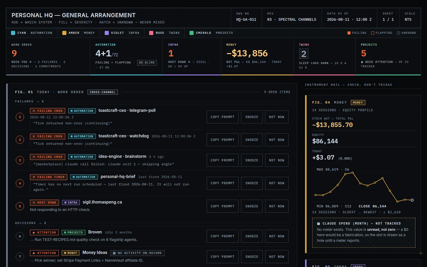
1440×900, nothing scrolled — what you see on opening it.
Every system gets its own hue — automation cyan, money amber, infrastructure violet, the twins rose, projects emerald — carried through that system’s rules, chips and dimension lines, so you navigate by colour once you have learnt the code.
Why I recommend it: it solved the problem the brief created. Spending colour on five systems should have made failure quieter, because Blueprint’s honesty depends on one accent being reserved for things that are actually broken. Spectral’s answer is stated in its own header, and it is the best idea in this round: “hue = which system · fill = severity · hatch = unknown — never mixed.” Colour tells you where; fill and shape tell you how bad. So a failing job carries both a red failing chip and a cyan automation chip, and the page gets five times more colour without failure losing an ounce of urgency.
It also names its own hierarchy out loud — the right-hand column is headed “instrument rail — check, don’t triage” — and it is the most honest of the four about money: the untracked Claude spend is drawn as a hole reading “no meter exists. This value is unread, not zero — a $0 here would be a fabrication.”
The catch: five hues is a lot to hold in your head, and a few stat-strip captions wrap awkwardly onto a second line. Both are fixable; neither is structural.
Verified: its tightest colour, violet line-work, measures 6.05:1 — double the 3:1 floor. All ten channel tokens clear both minima with margin.
The most striking
Cyanotype — colour in the ground
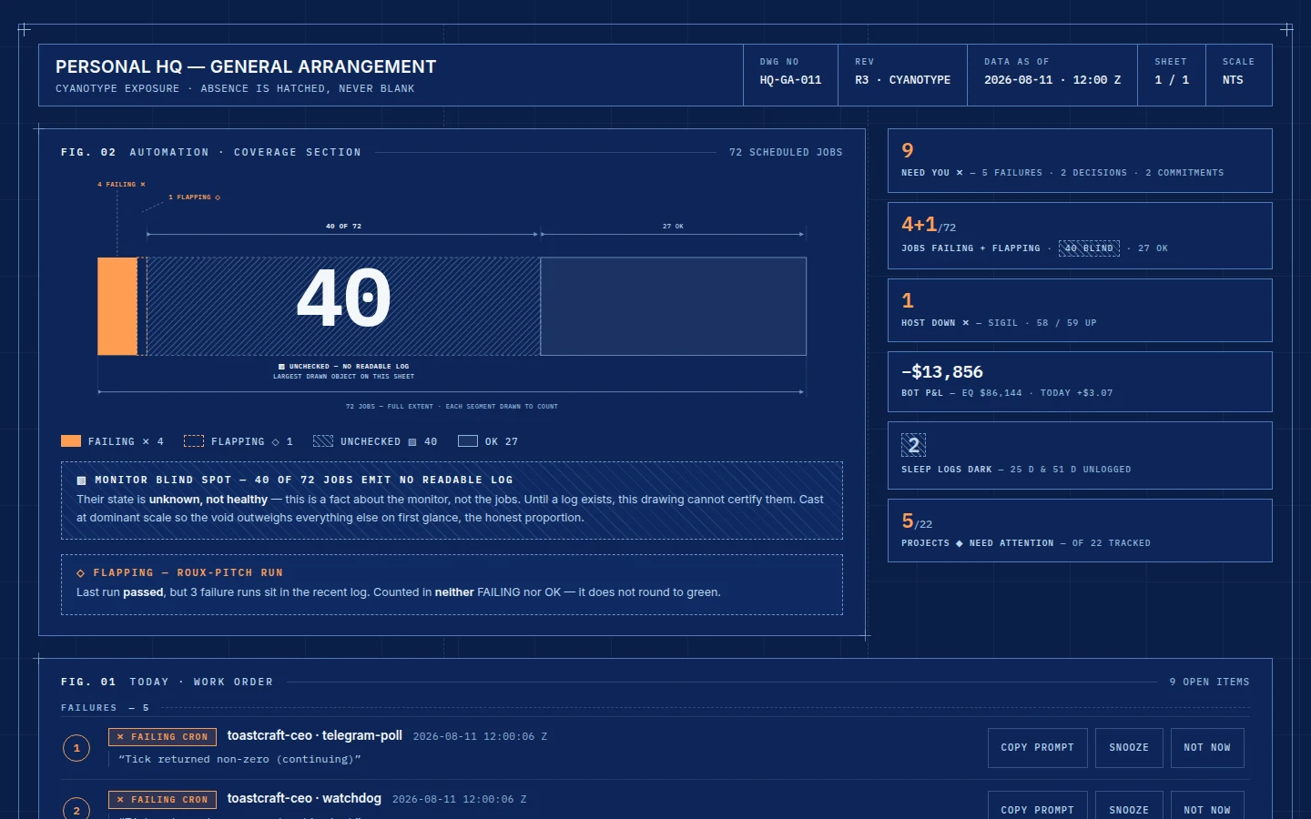
1440×900, nothing scrolled.
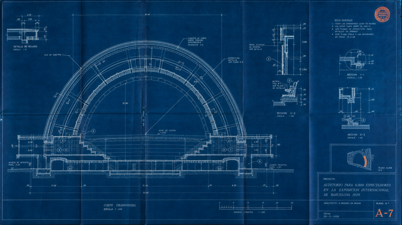
Not a dark screen with blue bits — the literal cyanotype, a deep Prussian indigo field with white and pale-cyan line-work drawn on it, the way a real blueprint is a photographic negative. It is the most beautiful page of the four and the one that most obviously answers “more visually dynamic”, and it gets there through sheer scale rather than motion: the hatched 40 is cast about ten times body size and captioned “largest drawn object on this sheet”, with the stat strip running as fine marginalia beside it.
Its ember accent could not survive on indigo, so it moved to a warm amber measured at 7.8:1 — which I confirmed.
It broke the thing Blueprint won on
Making absence the biggest object pushed the day’s nine items below the fold. On opening, you see how much the monitor cannot read before you see anything you can act on. That is the exact fault that cost a rival design a vote in round 2. It is a swap of two figures to fix, not a rebuild — but as it stands today, this page shows you the problem and hides the work.
Its designer gave up: the even column symmetry of the Projects and Infra grids, which are now deliberately unequal widths — intentional next to the mega-figure, but those sections lose the clean alignment Blueprint had.
The most atmospheric
Illuminated — the drawing is lit
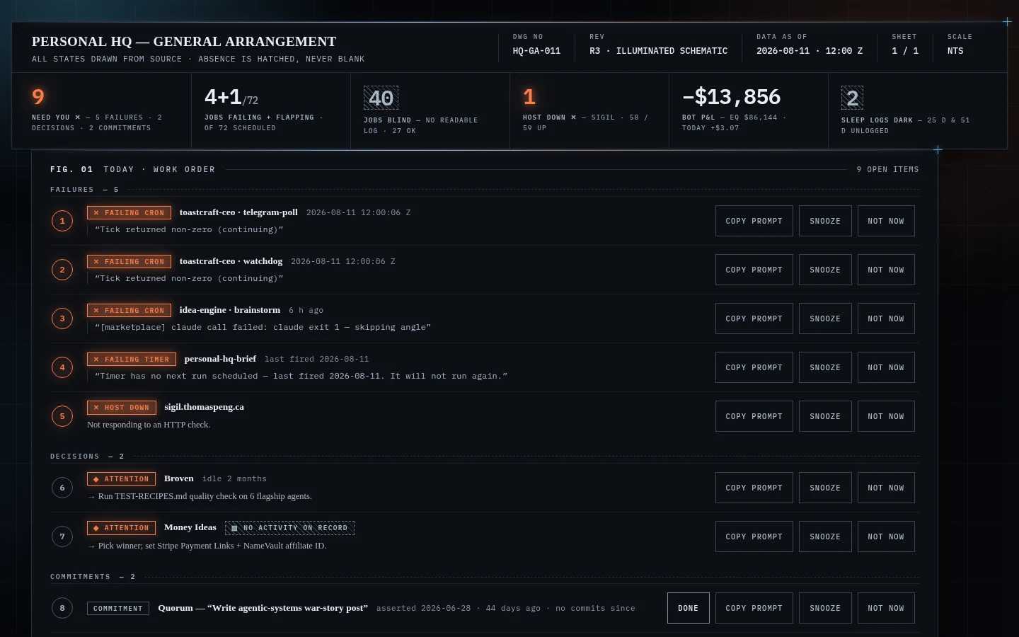
1440×900, nothing scrolled — after the clipping fix described below.
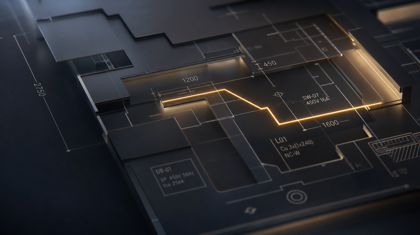
Panels sit on two lit elevations with edge-lighting and cast shadow, a slow wash drifts behind everything, and the failing segment pulses like a live circuit while the 40-job blind void stays deliberately unlit so it can never read as healthy. That last decision is the sharpest thing in the round: in a design where light means “energised”, refusing to light the unknown is the honest choice.
It is also the one that gets the reading order right without being told — stat strip, then the grouped day, all above the fold.
Two bugs found and fixed during review
The grid-breaking overlap was clipping the design’s own stat strip: every one of the six boxes lost its second line under the panel edge, so the headline numbers — one of the five things the design won on — were unreadable. The cause was a stray negative margin stacked on top of the intended overlap. Fixing it exposed a second instance of the same fault, where the automation figure’s own heading was hidden beneath the panel above it.
Both are fixed and the overlap survives. The screenshot above is the repaired page, re-captured after its lighting was pushed harder in the same pass. Worth knowing: depth effects hide layout faults — a shadowed edge over clipped text looks deliberate in a way a hard edge would not.
The honest caveat: even after the lighting was pushed, the depth reads far subtler on screen than the reference render promised. It is a very good dark dashboard rather than the lit model in the plate below.
The outlier
Drafting — inverted to light
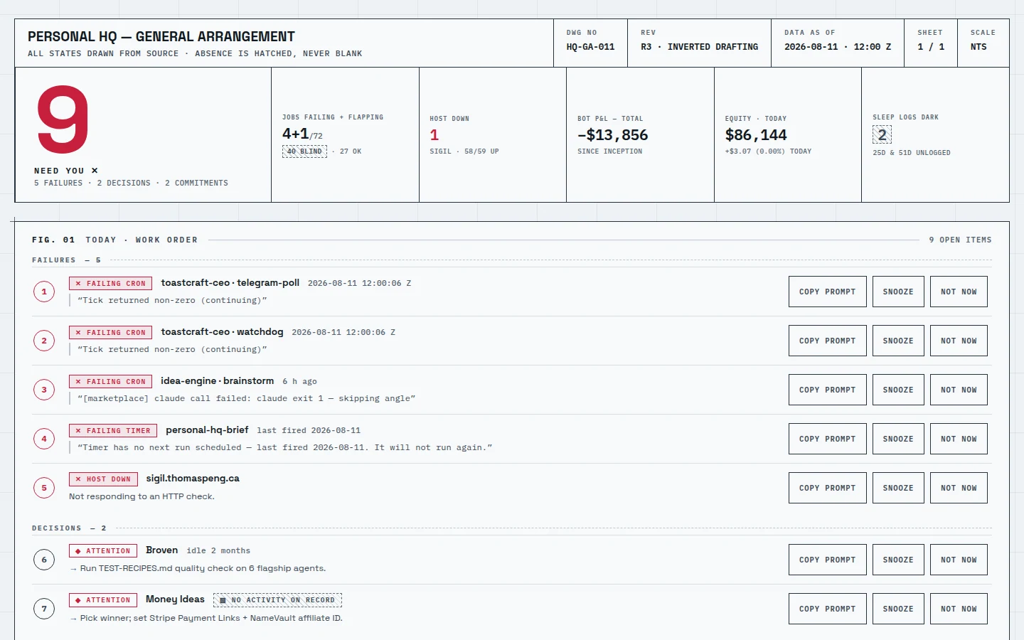
1440×900, nothing scrolled.
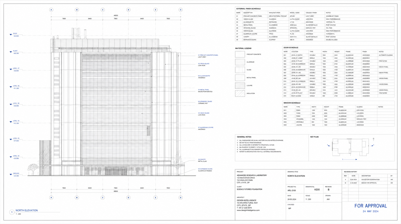
The drawing as it leaves the plotter: cold near-white sheet, graphite line-work, crimson annotation. This one exists to test whether the idea survives inversion, and it was held deliberately cool and technical — no cream, no brass, no serif — so it could not drift back toward the warm direction you rejected.
It does answer-first better than any of the other three: a large crimson 9 is the first thing on the page, with the five failures immediately under it. It is also the easiest of the four to read.
Why it is not my recommendation: the density-contrast idea did not land. At this size it reads as an excellent light admin panel — which is the closest of the four to “competent but not futuristic”, the thing you rejected two rounds ago. Its lesson is worth stealing even if the page is not: that hero numeral belongs in whichever direction wins.
Colour references
What each was chasing.
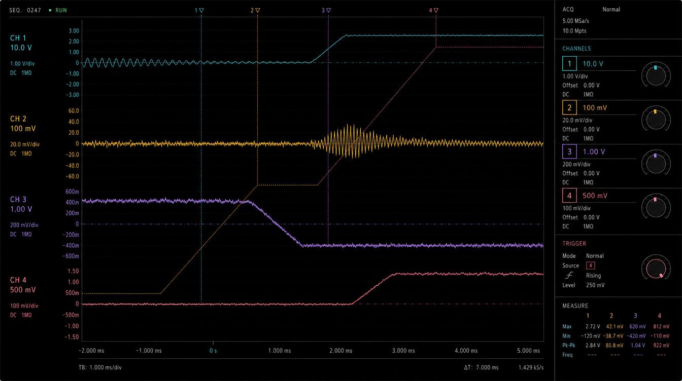
Generated to lock a feel before any code was written. Every word inside them is invented, so judge the colour and ignore the text.
The plate that solved something
The oscilloscope reference labelled each coloured trace
CH 1…CH 4 — a number as well as a hue — which is
exactly the discipline that keeps colour-coding usable for a colour-blind reader. Spectral
arrived at the same answer independently. The illuminated plate is the most beautiful of the
four and the least usable: it is drawn in perspective, and a dashboard cannot be. It is a
reference for light, never for layout.
The decision
One real tension, and it is yours to settle.
Two things you have asked for at different points now pull against each other, and this round made it concrete. Answering “what needs me today” first is what won round 2. Making absence the largest object on the page is what makes this dashboard honest rather than merely calm. Both cannot be the biggest thing above the fold. Cyanotype chose honesty and buried the work; Illuminated, Spectral and Drafting chose the answer.
My recommendation is Spectral, because its colour rule — hue for which system, fill for how bad — is the only proposal here that makes the page richer without making failure quieter, and because it keeps the answer first. If you want the most beautiful page and are willing to spend one fix on it, take Cyanotype and swap its two figures. If you want the calmest and most readable, Drafting, accepting it is the least futuristic of the four.
Whichever you pick gets rebuilt properly on the real token layer with the tests and the honesty affordances intact — none of that work is lost, since it sits underneath the paint. Nothing has been deployed and the live dashboard is untouched.
Personal HQ redesign · round 3, 11 August 2026 · concepts are static mockups and their controls are inert. Contrast ratios independently recomputed; captures are viewport-only at 1440×900.