dashboard.thomaspeng.ca · 11 August 2026
Round 2:
four designs, judged blind.
Obsidian and schematic as the brief, easier to read and more visual as the requirement. Four designers worked in isolation on the real data. Then eleven critics who had never seen any of them were handed two screenshots with neutral filenames and asked only which one they would rather use — no scores, no idea which was the new work. Two of the four won.
The result
Two beat the bar, two lost.
The bar was Obsidian from round 1 — the one you endorsed. Every comparison was captured at exactly 1440×900, same viewport, same crop, no scrolling, so nothing but the design itself differed. A design wins only when two of three critics pick it.
| Design | Verdict | Vote | Why it went that way |
|---|---|---|---|
| Blueprint | Won | 3–0 | Grouping the day into failures / decisions / commitments, plus a stat strip, beat a flat undifferentiated list. |
| Cluster | Won | 2–1 | Gauges, sparkline and bars let the eye read magnitude before text. The dissenter said the action list sits too low. |
| Timeline | Lost | 0–2 | The log-scaled axis has to be decoded before you learn what is urgent. |
| Topology | Lost | 0–3 | Unanimous. You must trace wires and cross-reference footnotes to find out a host is down. |
Eleven of twelve critics reported; one Timeline critic went idle without a verdict. It could not have changed that result — two of its three had already picked the bar.
The one thing all eleven agreed on
Every vote for the bar named the same property: Obsidian opens with a large 9 and the sentence “Nine things need you today”, then a ranked list with an action on every row. Every vote against Timeline and Topology said the same thing in different words — you have to decode a coordinate system or trace a diagram before the page tells you anything.
Every vote for the winners named the opposite lack: Blueprint’s six-box stat strip and its grouped sections, Cluster’s gauges and sparkline. So your two requirements are not in tension. The answer goes first in plain language; the instruments go underneath it. That is the finding, and it is worth more than the ranking.
Winner · 3–0
Blueprint — the general-arrangement drawing
The dashboard as a technical drawing: title block, registration marks, hairline grids, every number dimensioned with leader lines. Ember is spent only on live failure — solid for failing, dashed for flapping. Absence gets a third vocabulary of its own: hatched voids with their own dimension lines for the 40 unreadable jobs, both sleep gaps, and the unmetered Claude spend. The 40-job hatched void is deliberately the largest object on the page.
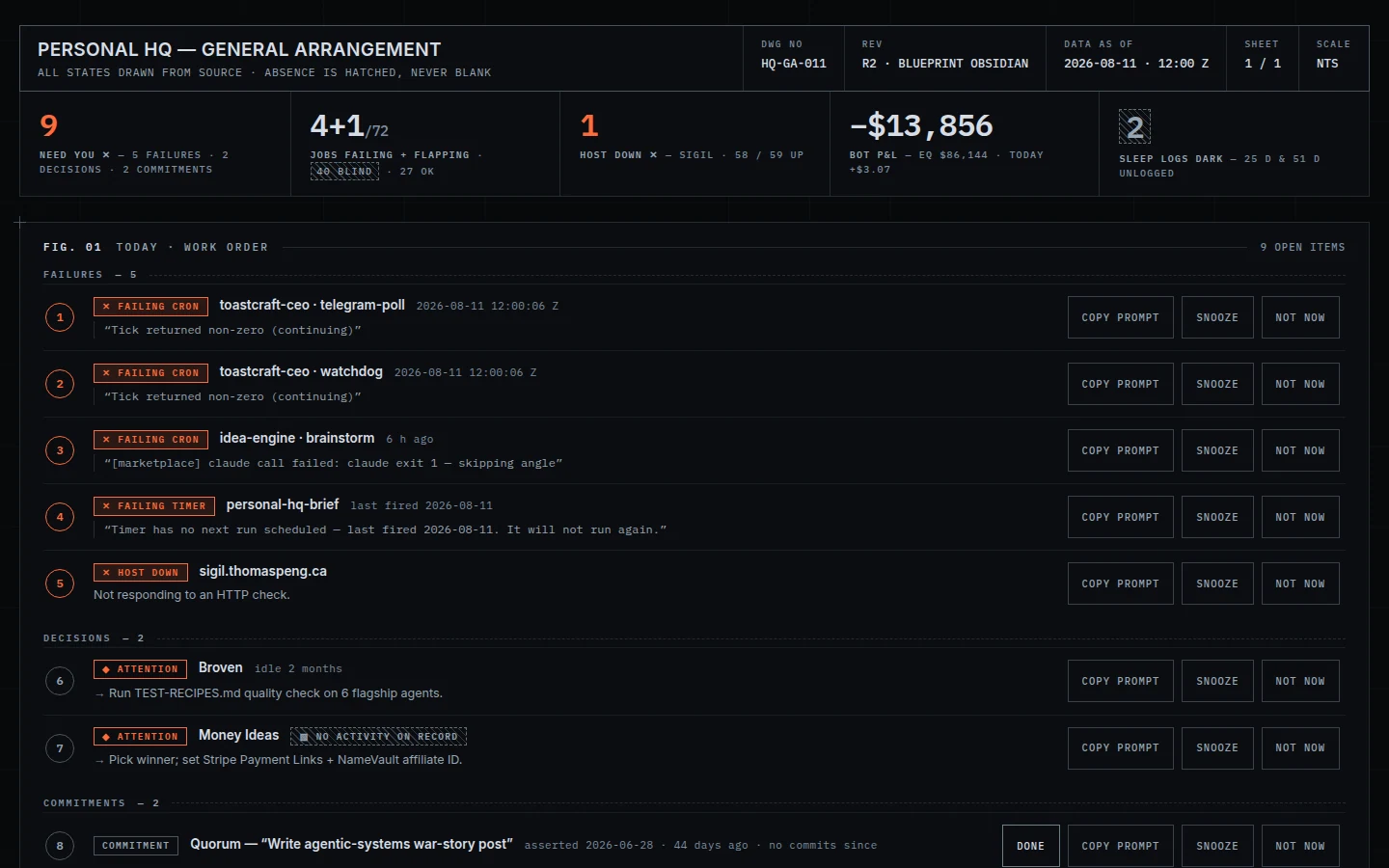
Exactly what the critics were shown, 1440×900.
What the critics said: “a six-box stat strip up top… answers ‘what needs me today’ in one glance, then groups the list into failures / decisions / commitments with numbered items and subtotals.” And, from another: “that grouping alone makes triage easier than an undifferentiated stack.”
Its designer gave up: per-item drill-down — today rows stay one line plus a quote — and every flourish and animation. All line-work, zero motion.
Winner · 2–1
Cluster — the cockpit band
Eight instruments across the top, then a rule labelled “glance ends · read
begins”, then dense schematic rows. The automation dial is the honest one: its largest
arc segment is a hatched hole reading 32 / 72 VERIFIED rather than a flattering
“27 OK”. The spend gauge has no needle at all and reads NOT TRACKED.
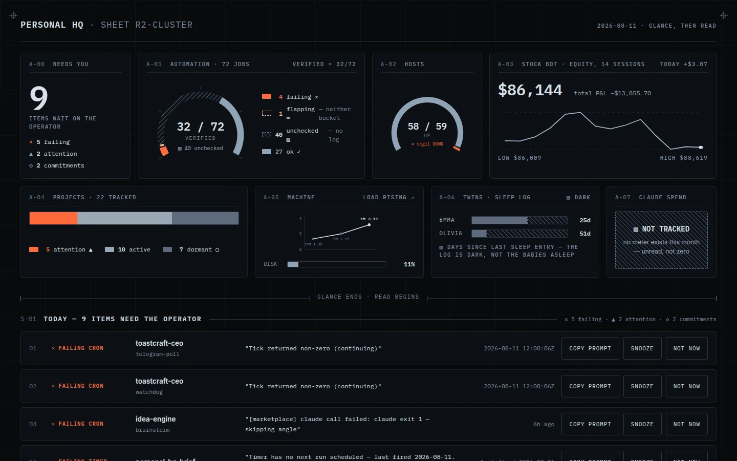
Exactly what the critics were shown, 1440×900.
What the critics said, for: “the 32/72 and 58/59 arc gauges, the stock line chart, and the load/disk bars each compress a real metric into a glanceable shape… one designed system rather than a grid of widgets bolted together.”
And the dissenter: “the actual ‘9 things need you’ list buried at the bottom.” I checked that rather than taking it at face value, and it is half right — see below.
One critic’s diagnosis was wrong, and the correction matters
The needs-you counter is in fact the first instrument on the page, not buried. But the nine rows you can actually act on start below the “glance ends · read begins” divider — which at a 900px-tall window puts them below the fold. So the count is instant and the actionable list is not. That is a real defect and a precise fix, and it is not the fix the critic asked for.
Its designer gave up: leader-line callouts on the dials (legends stack beside each gauge instead, crisper at small radii) and all decorative depth. The only motion is a failure-dot pulse, disabled under reduced-motion.
Lost · 0–2
Timeline — the signal axis
One log-scaled time-before-now axis with NOW at the right edge, four instrument tracks, and a dedicated NO DATE / NO LOG column behind an explicit axis break — so absence has a physical place and can never impersonate health. The twins’ 589h and 1221h sleep gaps are hatched spans with real dimension lines. Conceptually it is the most rigorous of the four, and it lost anyway.
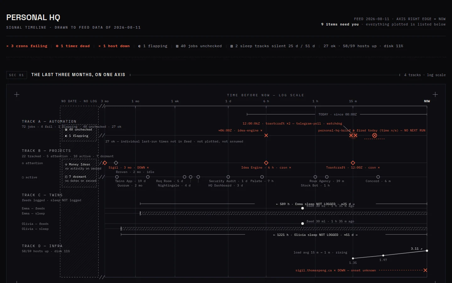
Exactly what the critics were shown, 1440×900.
Why it lost: “visually elaborate but asks the reader to decode symbols — diamonds, circles, X’s, cross-hatched bands — scattered across four dense tracks before finding what needs attention today.” The other: “forces the eye to hunt tiny scattered labels and decode axis math before finding what’s urgent.”
Lost · 0–3, unanimous
Topology — the estate schematic
The estate drawn as jobs → projects → hosts, with six verified edges and ember spent
only on true faults, so failure reads as a lit trace. It found things the others did not: both
Toastcraft crons converge at one junction stamped 12:00:06Z; Idea Engine burns on its cron side
while its host stays green; Sigil dangles from an open “no cron” terminal, dark and
unwatched. Its title block declares verified links drawn: 6 · invented: 0.
This is the most insightful of the four and the most comprehensively rejected.
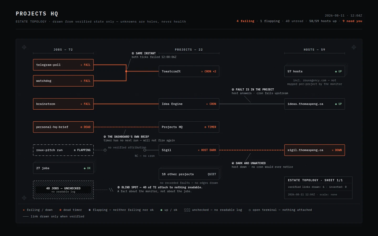
Exactly what the critics were shown, 1440×900.
Why it lost: “the answer is buried in a node graph with circled footnote numbers you have to cross-reference against a legend just to learn a host is down.” And: “it makes the reader trace nodes and edges to figure out what matters… the other hands over the triage instead of asking the reader to do it.”
The bar
What all four were measured against.
Open Obsidian → — round 1, the one you endorsed. Near-black, one ember accent, and a rule stated in its own footer: “one accent — if it isn’t ember, it can wait.” It won six of eleven votes across the four comparisons, entirely on the strength of leading with the answer.
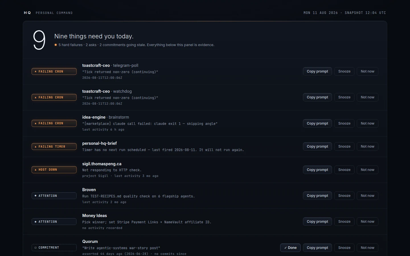
The bar, captured identically at 1440×900.
My recommendation
Stop looping. Build the merge.
The signal is consistent across eleven independent reads and another round would spend real money re-confirming it. What I would build instead takes the winning part of each:
- Obsidian’s hero — the count and the sentence, first thing on the page, above everything else. This is what six critics reached for.
- Blueprint’s grouping — failures, decisions and commitments as labelled sections with subtotals, instead of one flat stack of nine.
- Cluster’s instruments — the gauges and sparkline, placed below the fold divider where they support the answer rather than compete with it.
- The hatched void, from all four independently — unreadable sources get their own visual vocabulary, distinct from both good and bad. The 40 unverified jobs stop reading as calm.
Read the win honestly
Two designs beating the bar on the first round is unusual — this technique’s flagship demo never beat its own bar in four rounds. But the bar here was one of my earlier mockups that you liked, not a shipped product by someone else. So “Blueprint won” honestly means better than my previous best attempt, not better than the best dashboards out there. If you want the stronger claim, the bar has to be somebody else’s real product.
The ledger of every round, in full, is at workbench.md.
Personal HQ redesign · round 2 judged 11 August 2026 · concepts are static mockups and their controls are inert. Nothing has been deployed; the live dashboard is untouched.